Case Study · Process Documentation
Case Study
Yiyang · Andrew · Henry · AI
A cross-medium interactive narrative spanning web, AR, VR, and physical space, developed over 14 weeks by a team of three designers + AI.
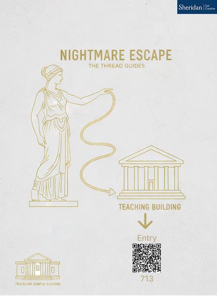
Read the Process ↓The Trafalgar Labyrinth is a trans-media interactive narrative that turns Sheridan’s campus network into a digital maze. Players see an on-campus poster about a Greek game, scan the QR code, and enter the web hub — becoming Theos, a player recruited by ARI to help secure compromised areas in the network before the Minotaur system spreads. Every platform is a space within the labyrinth — designed to disorient. Players are pulled across media and made to feel genuinely lost, yet the underlying architecture always moves them toward the exit. The maze is the disguise; the progression is the design.
A hub-and-spoke experience across 6 platforms: a web game hub with puzzle locks, a WebGAL visual novel, an AR poster overlay, a VR escape room, physical campus artifacts, and three distinct endings. Players enter the digital network through the web hub to help ARI secure compromised areas within Sheridan’s network — collecting fragments of the password “THREAD” to defeat the Minotaur system and escape the labyrinth.
The Theseus & Minotaur myth gave us a clear antagonist, guide, and goal. But more importantly, it justified every platform as a distinct corridor inside the maze. A maze aims to confuse — so each platform introduces new rules, new media, and new disorientation, while the system beneath always moves the player toward exit. The experience is designed to mesh technology, art, and storytelling into a single seamless illusion: Sheridan’s own network, hacked.
The design decisions, dead ends, AI integration, testing insights, and process reflection from concept through to final deployment. A reader who has never played the game should understand our methodology from this page alone.
How do we design a narrative that survives across four disconnected media without losing coherence — and keeps a campus audience engaged for 15 minutes?
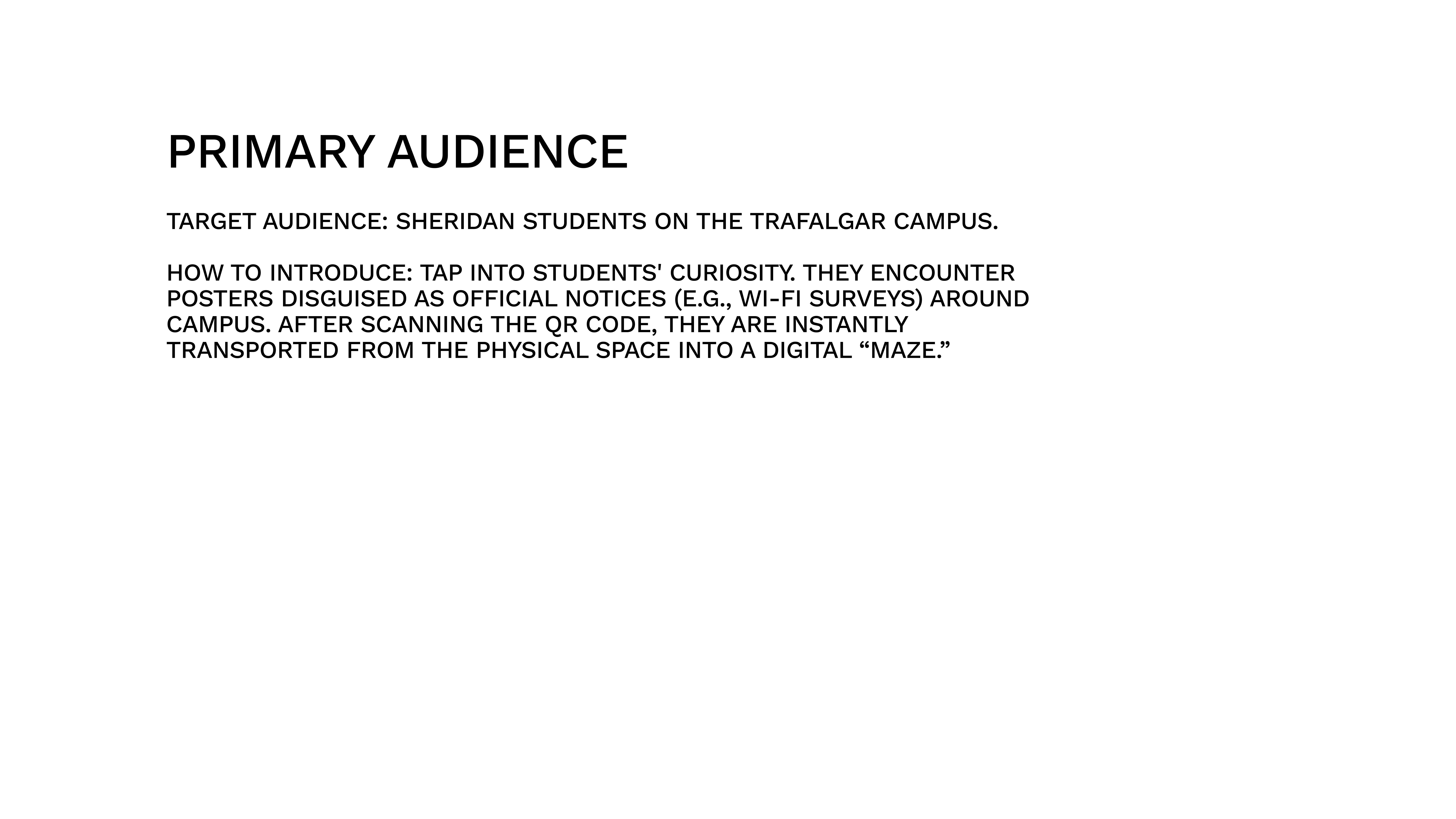
Students scroll past posters daily. Traditional interactive fiction stays inside one browser tab. We identified two core tensions that shaped every subsequent decision:
Three formal deliverables, each building on the last. The tabs below document how we got there — not just what we made.
Develop the interactive narrative itself: concept, characters, branching logic, art direction, and a working prototype hub.
We started with a broad brief: build a trans-media narrative. Early brainstorms explored escape rooms, scavenger hunts, and ARGs. We settled on the Theseus myth because it gave us a clear antagonist (Minotaur), guide (Ariadne/ARI), and goal (escape the labyrinth) — a structure that naturally maps to puzzle-based gameplay.
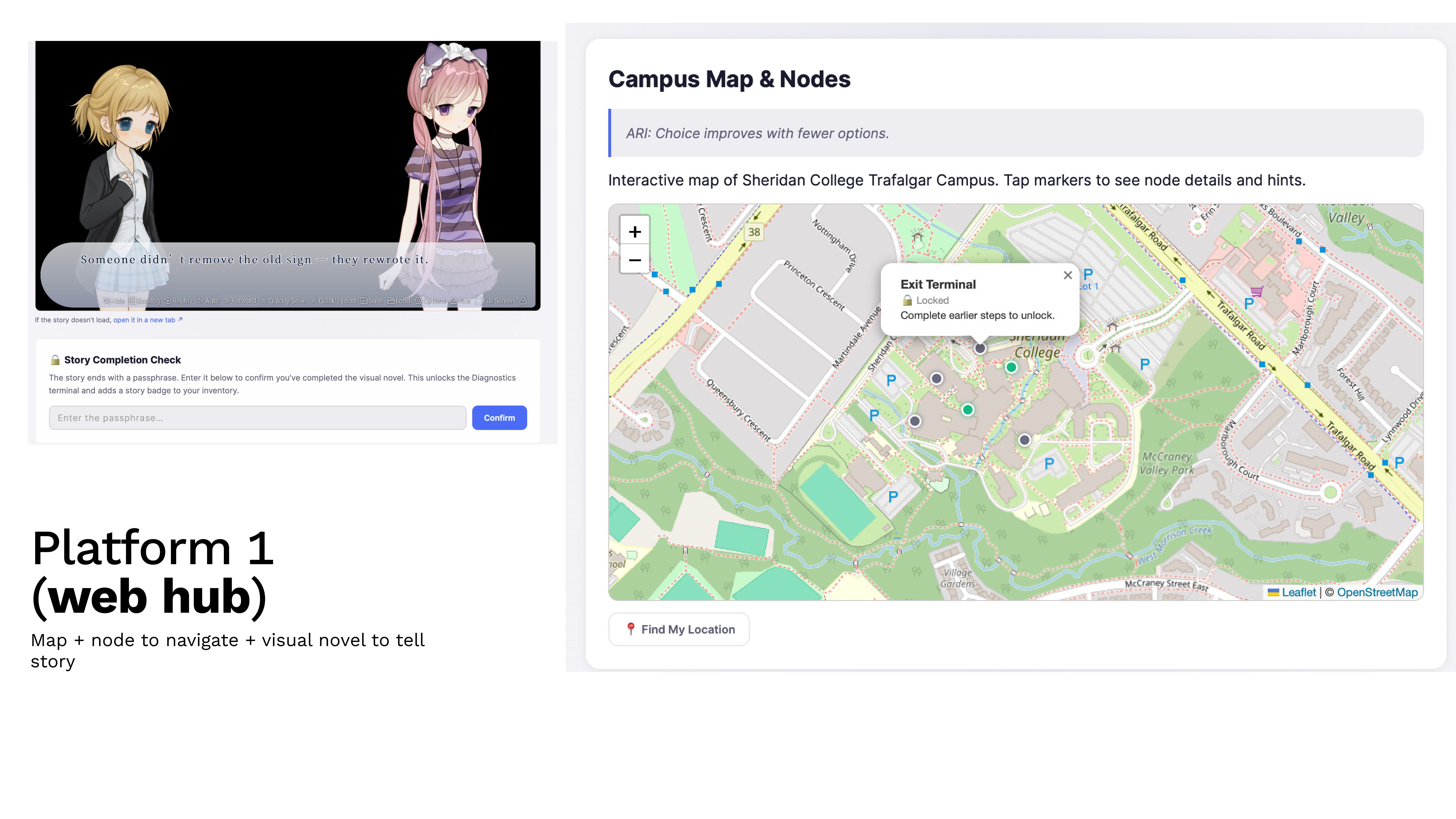
Each team member prototyped their assigned platform in parallel: Yiyang on the web hub and WebGAL integration, Andrew on VR and physical artifacts. Henry contributed early-stage lore research and story concept development. Weekly syncs ensured the narrative thread remained consistent as each corridor took shape.
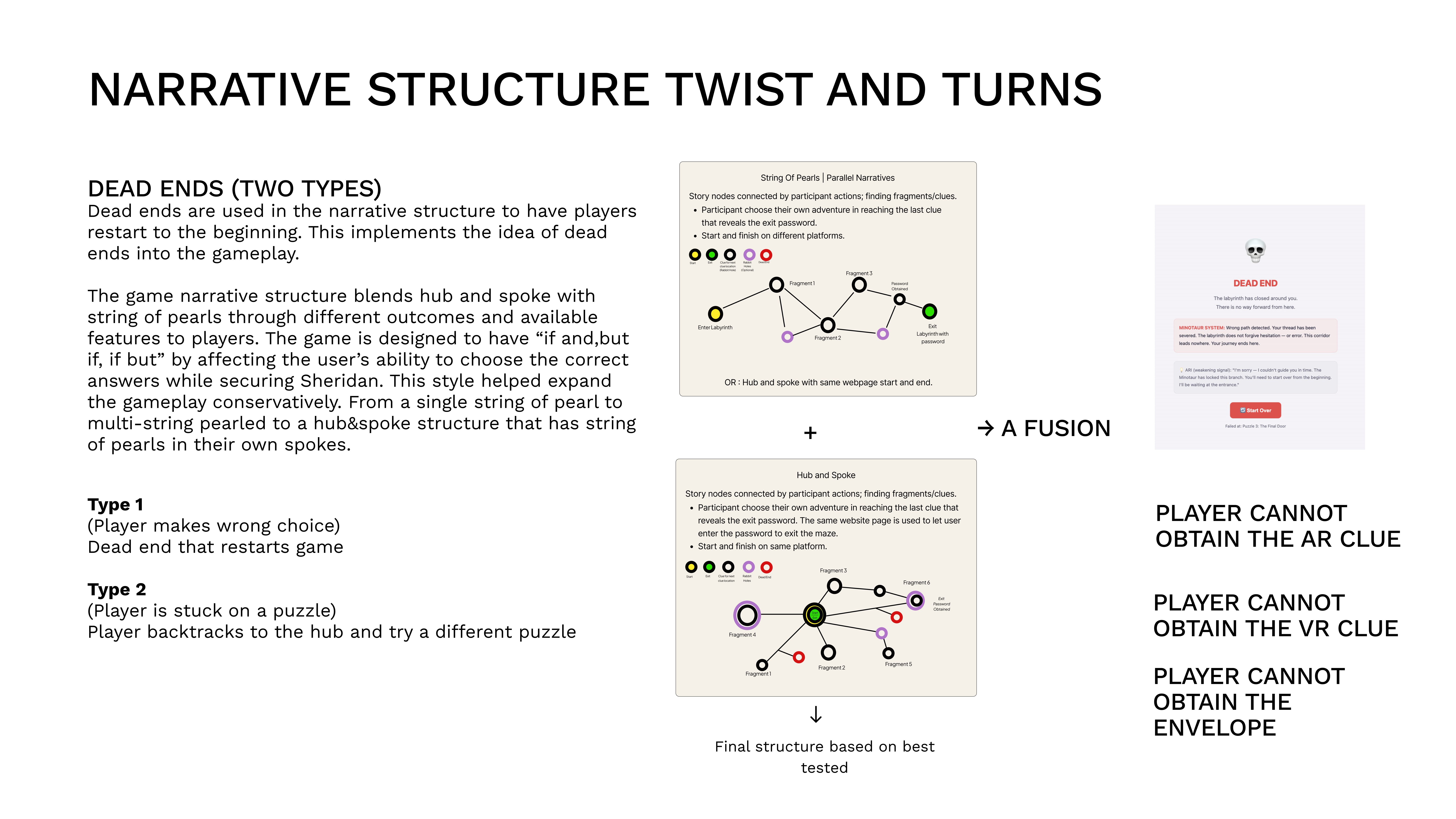
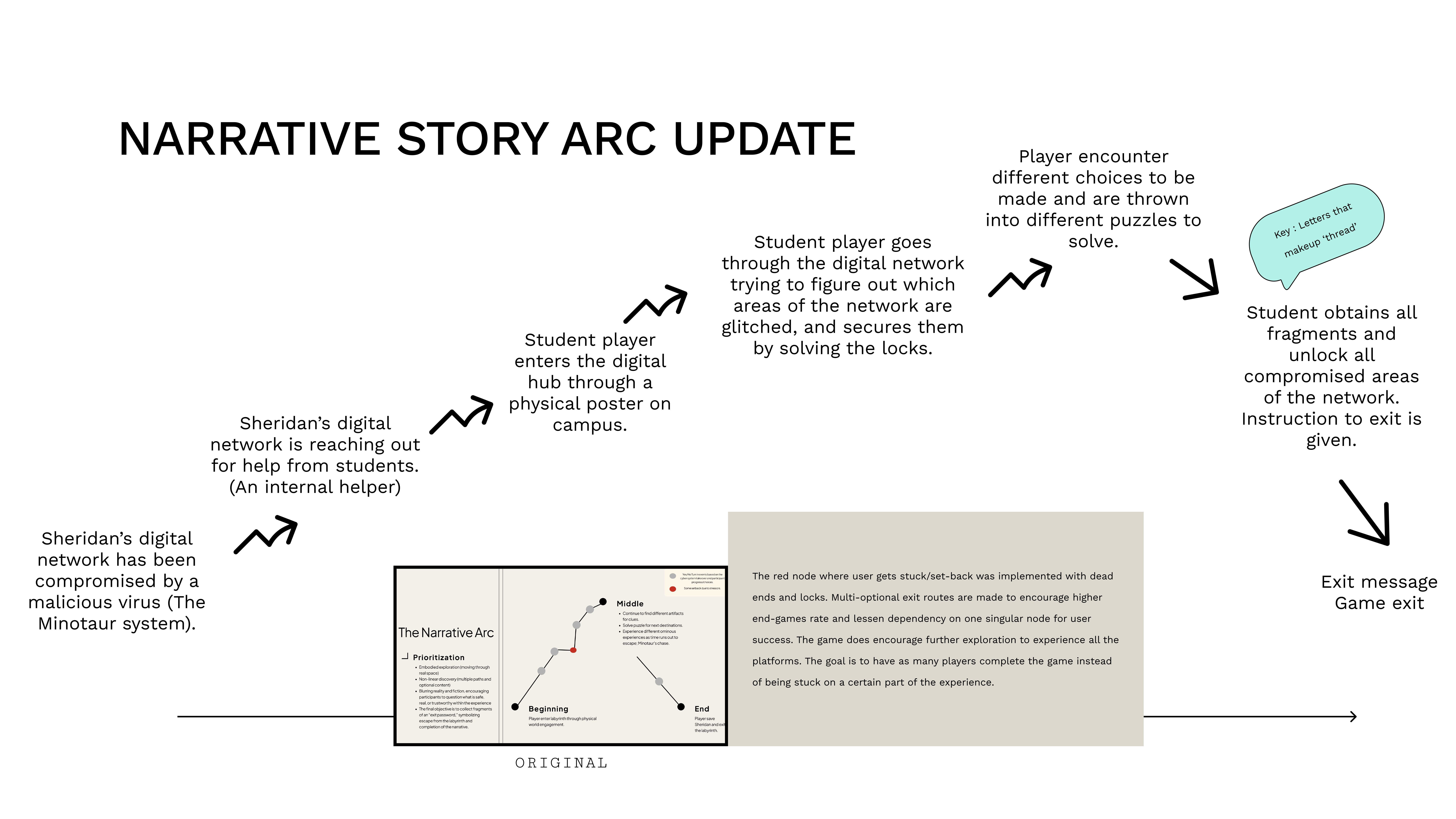
We designed two narrative structures: Normal Mode (String of Pearls — linear progression, AR/VR optional) and Hard Mode (Hub & Spoke — all 6 nodes from start, everything mandatory). This came from realising one structure couldn’t serve both casual and invested players.
AR/VR experiences on a phone require user knowledge and technological familiarity. To avoid players getting stuck on a specific AR/VR node, we used a Hub & Spoke structure to complement the explorative experience — players can always go back and take another route. The result: linear storytelling through the basic web hub puzzles, explorative play with optional AR/VR (all routed to the common exit), and a hard mode requiring every node. The narrative structure itself changes because of this modular design, giving the game design flexibility.
Reliability was addressed through web integration: AR/VR is accessed via QR codes or direct links from the hub, not as standalone Unity builds. Web-based AR/VR caters around the web hub as a focal point — consistent with the hub/spoke and string of pearls narrative structure rather than requiring a separate access pattern.
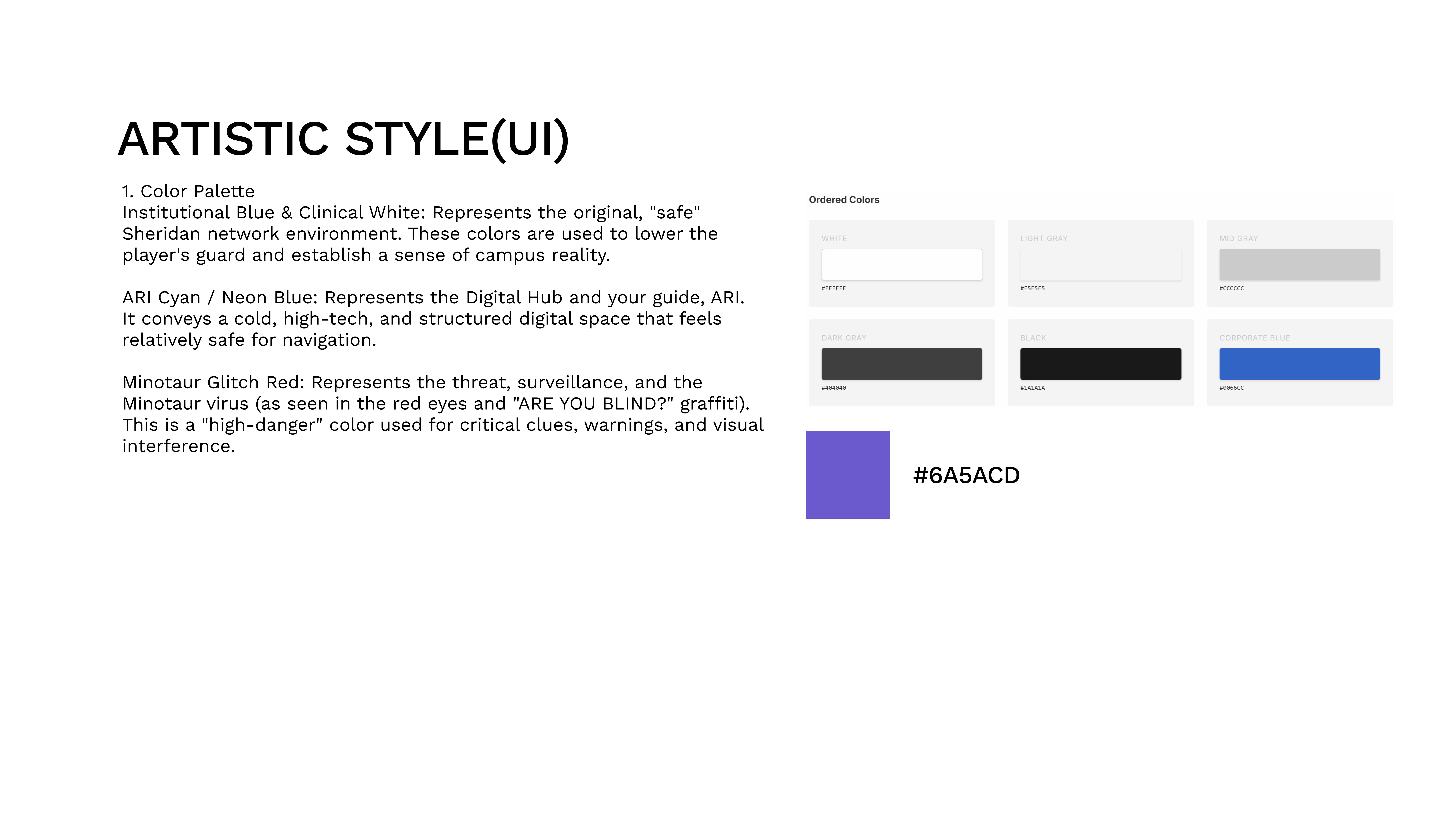
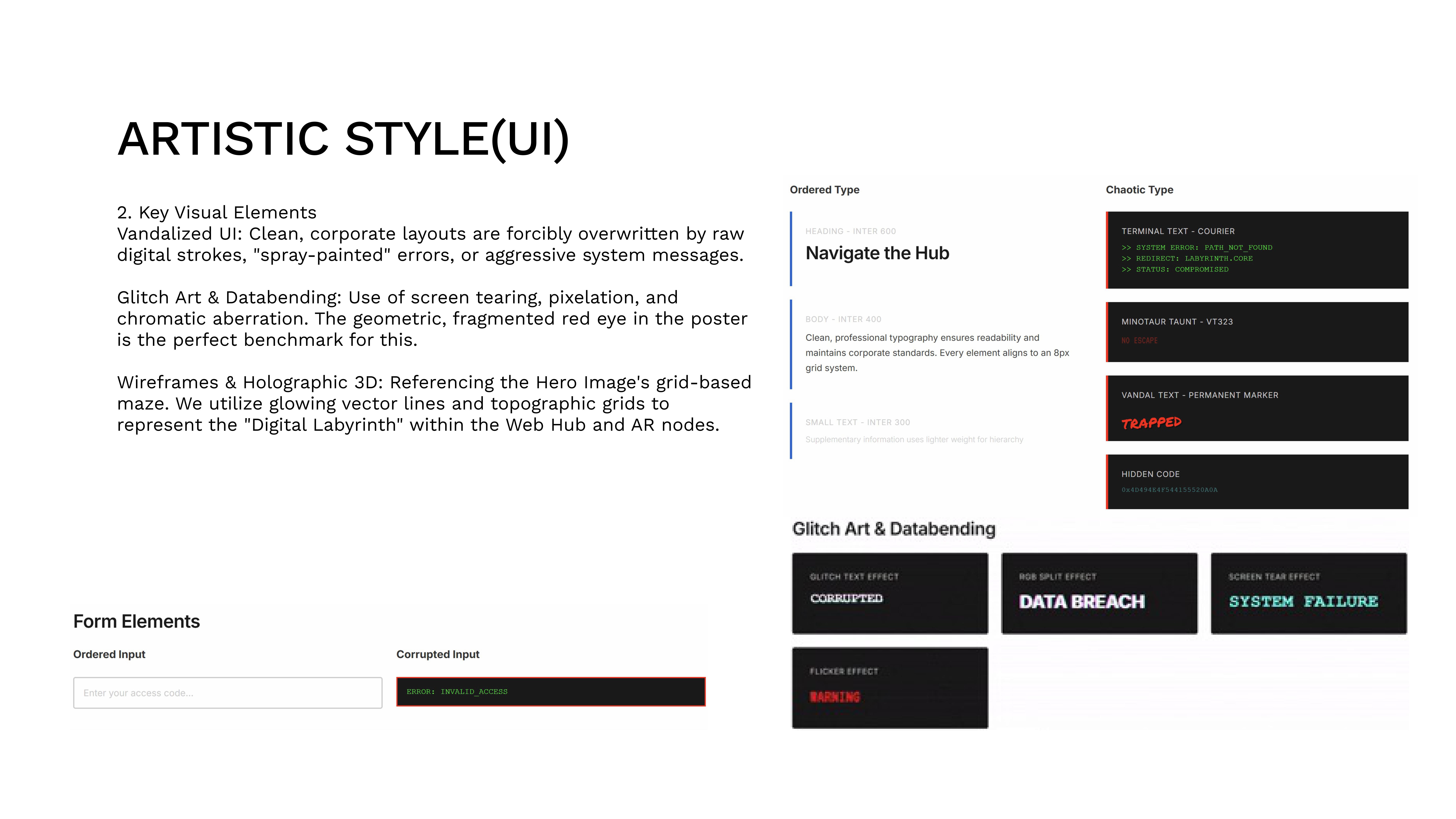
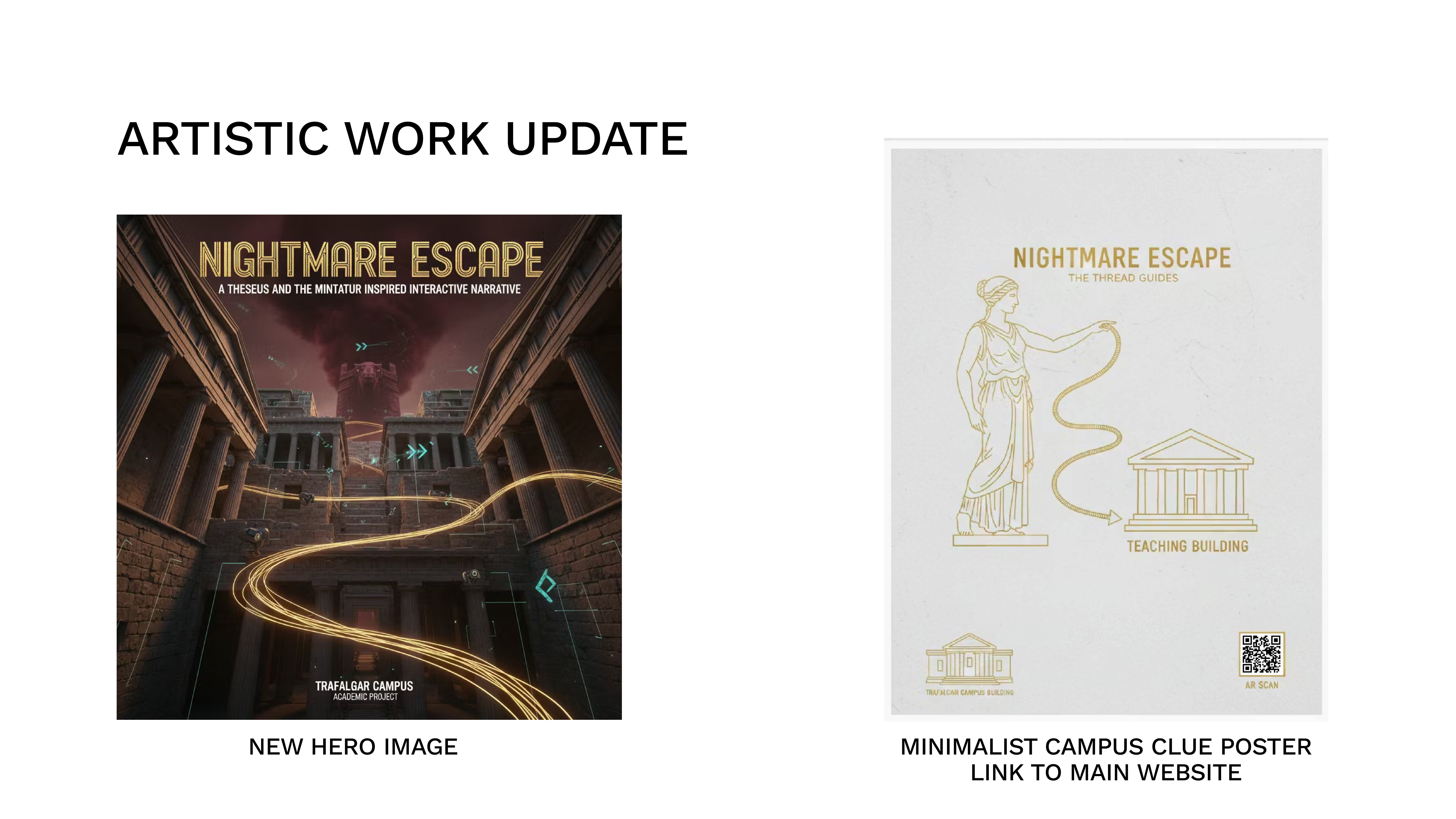
The visual identity is built on the contrast between corporate cleanliness (Sheridan’s institutional aesthetic) and corrupted hacking (the Minotaur system’s interference). The web hub reads as a clean portal being destabilized by glitch effects, distorted text, and hostile system messages — not literal graffiti. The VR room contains a graffiti bottle as a subtle environmental detail, but the WebGAL and web hub remain visually “clean” with corruption expressed through interface corruption rather than surface decoration. The narrative is about a system being hacked, so the corruption is digital, not physical.
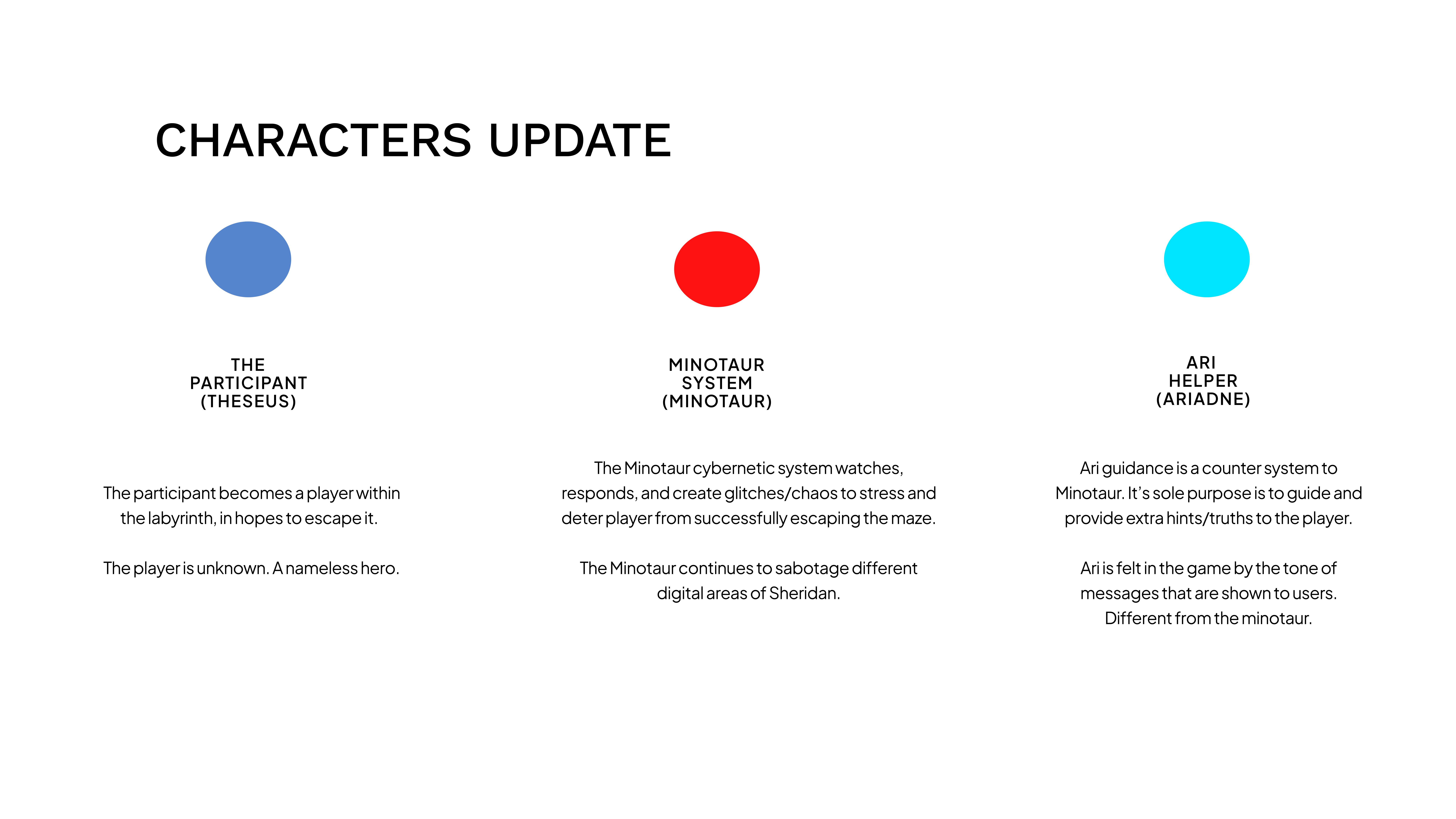
The player is nameless by design (any student can self-insert). The antagonist is a system, not a person — glitches, misdirected links, and hostile messages are the Minotaur. ARI is a counter-system whose calm tone players learn to trust as a navigation tool.
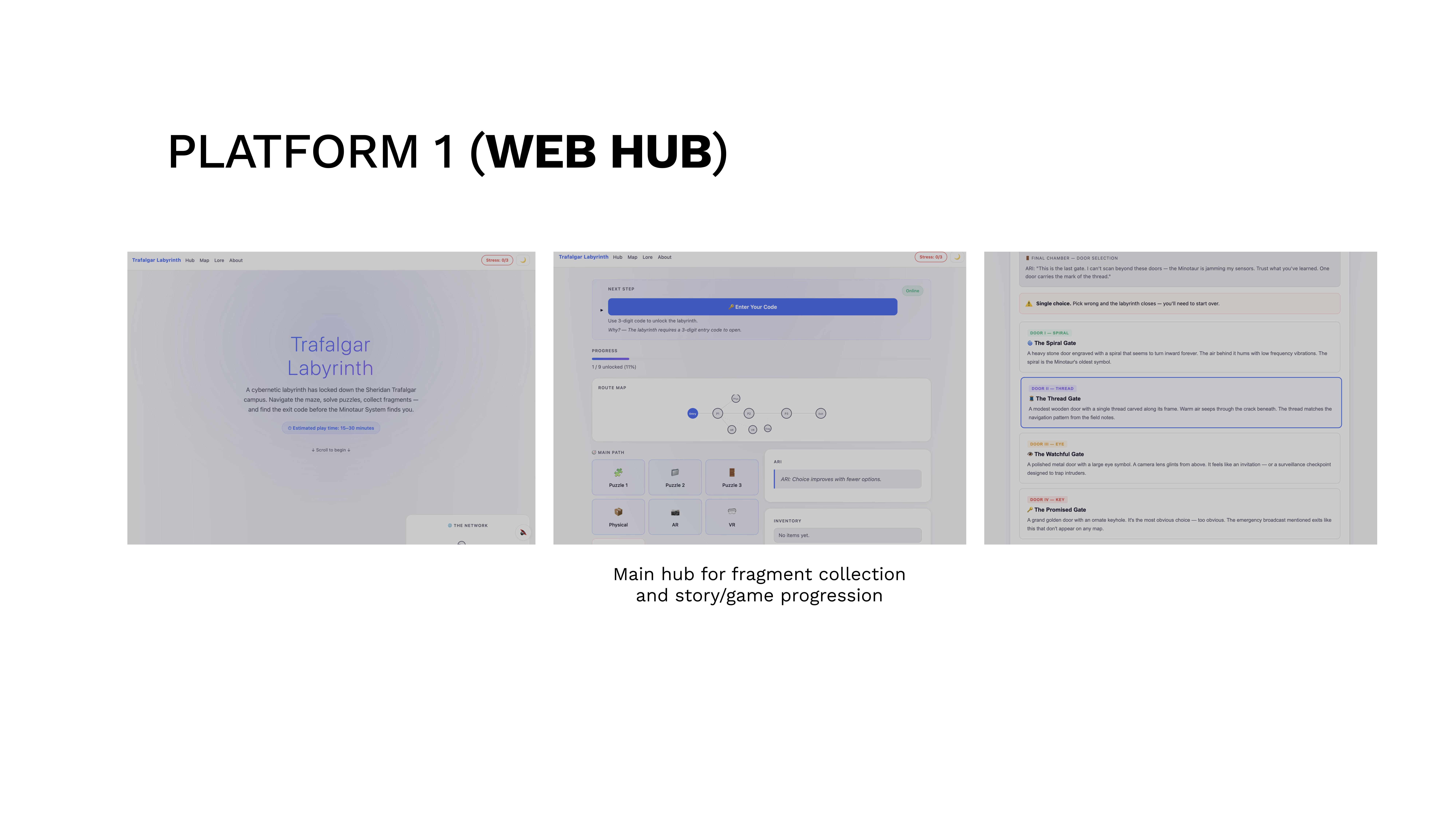
A working web hub prototype with three puzzles, entry/exit code logic, a lore page, and the ARI guidance system. The dual-mode architecture was defined but only Normal Mode was playable at P1 deadline.
Early hub wireframe sketch
Color palette exploration
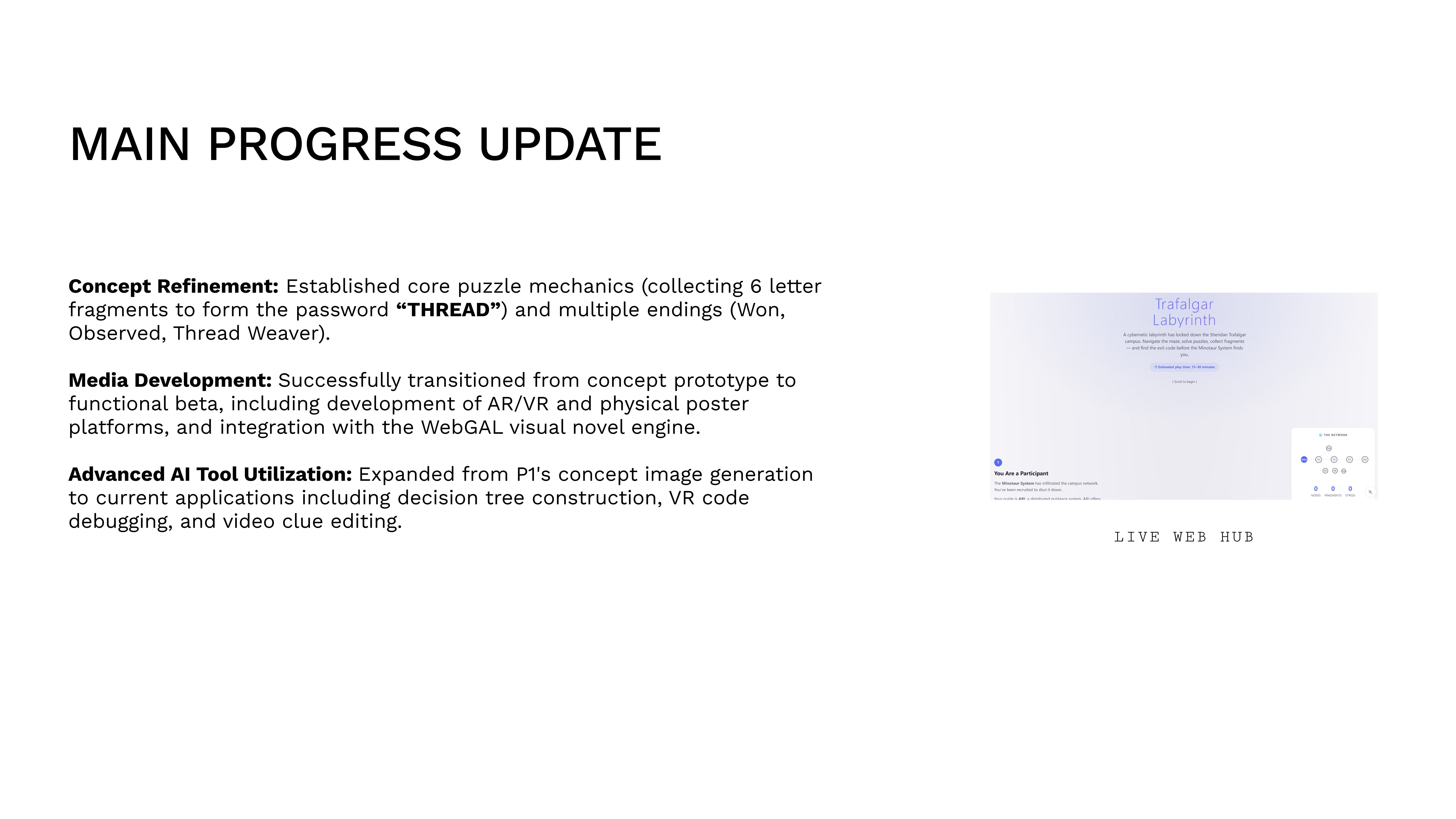
Hub prototype — first build
Map the entire interactive experience: every node, every branch, every platform transition, every possible ending. The P2 deliverable was the architectural blueprint.
We mapped every player path across all platforms using a node-based system. Each node has an ID, type (web/ar/vr/physical/rabbit), hint text, and a list of nodes it unlocks. This data structure lives in config.js and drives the actual game logic — the map isn’t just documentation, it’s the source of truth.
We built two complete node maps (Normal and Hard Mode) and tested them against paper prototypes before committing to code.
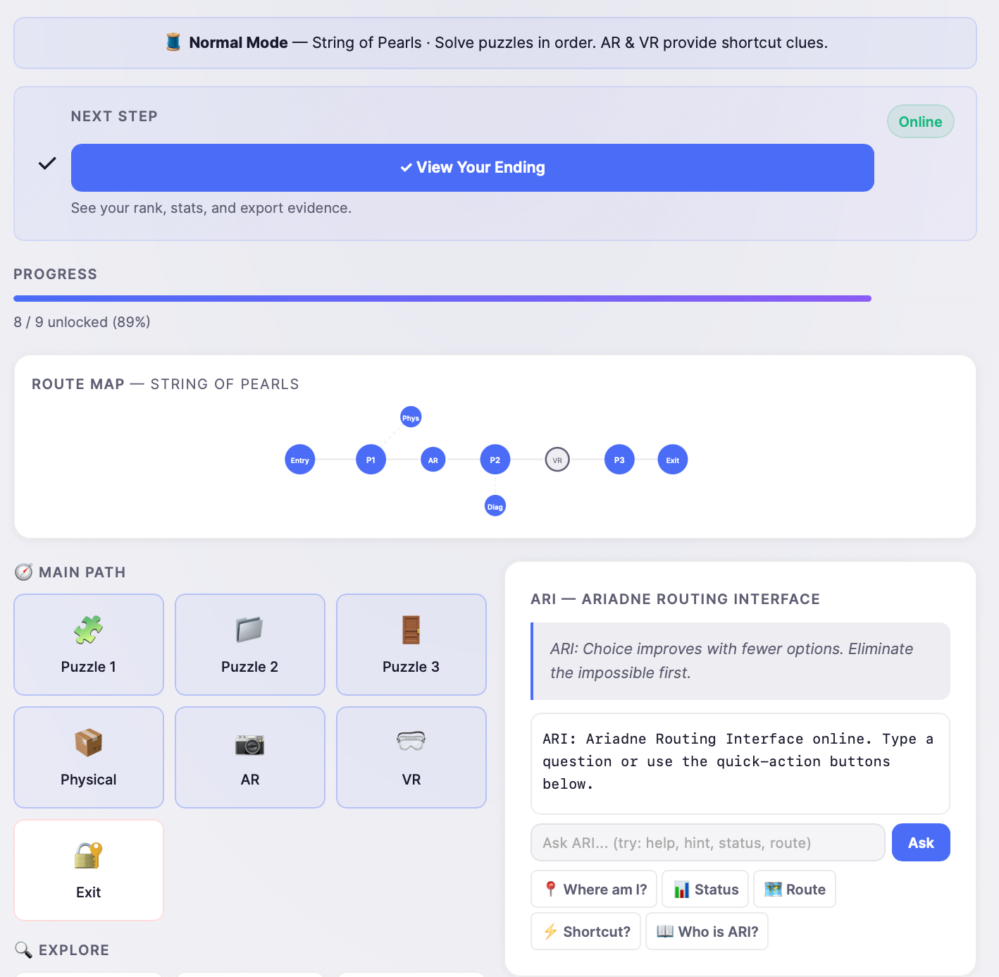
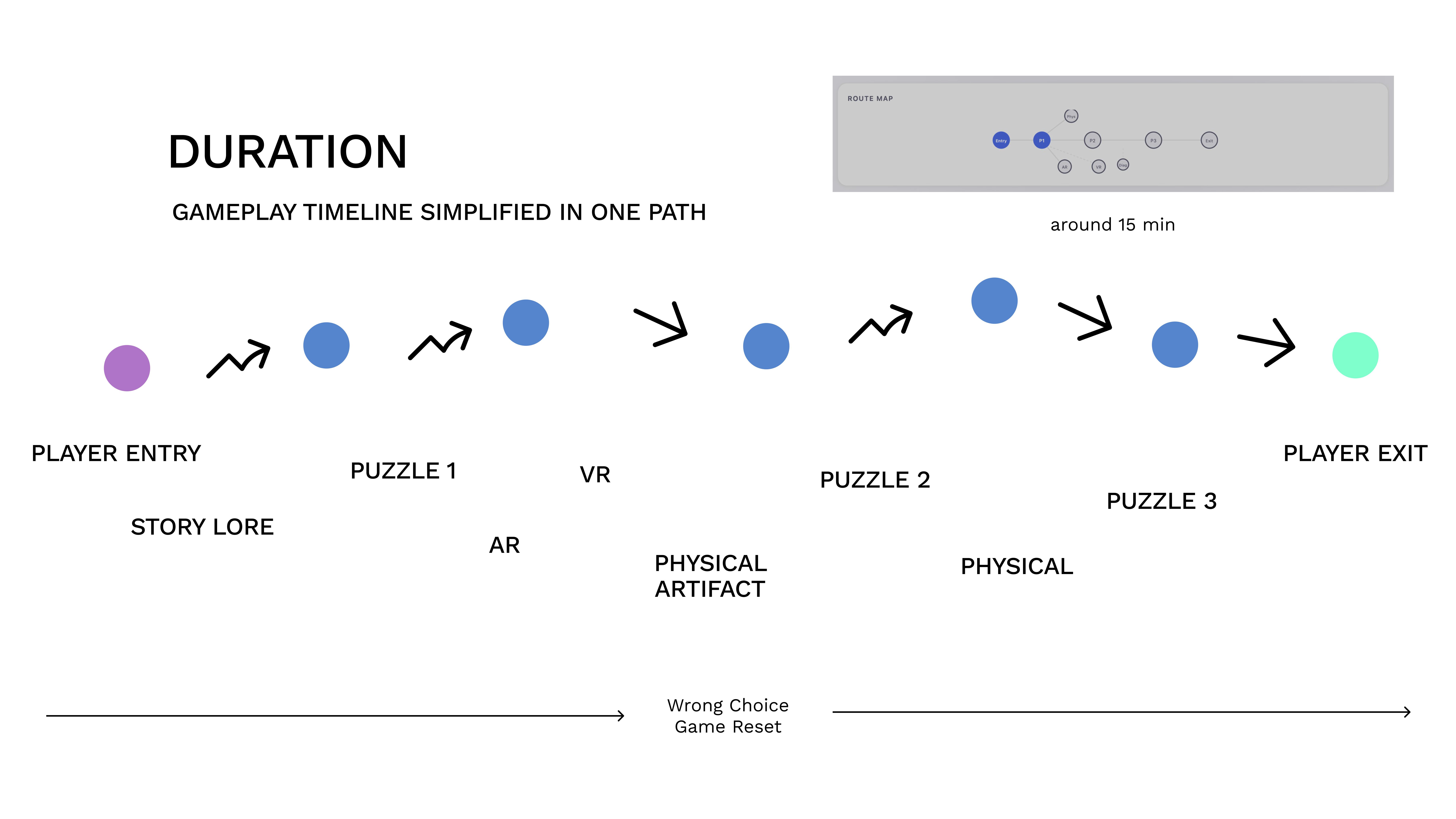
We chose to build two clean, separate structures rather than fuse them. Normal Mode is a pure String of Pearls (Entry → P1 → P2 → P3 → Exit) with AR/VR branching off after P1 as optional shortcuts. Hard Mode is a pure Hub & Spoke: entry unlocks all 6 fragment nodes simultaneously with no dependencies between them. Keeping them pure made each mode predictable to test and balance.
All node data, codes, and puzzle answers live in a single config.js file. As long as the content that needs to be consistent remains consistent across the different modes, we could swap structures, adjust difficulty, and rebalance without touching game logic — a decision that saved us dozens of hours during testing iterations.
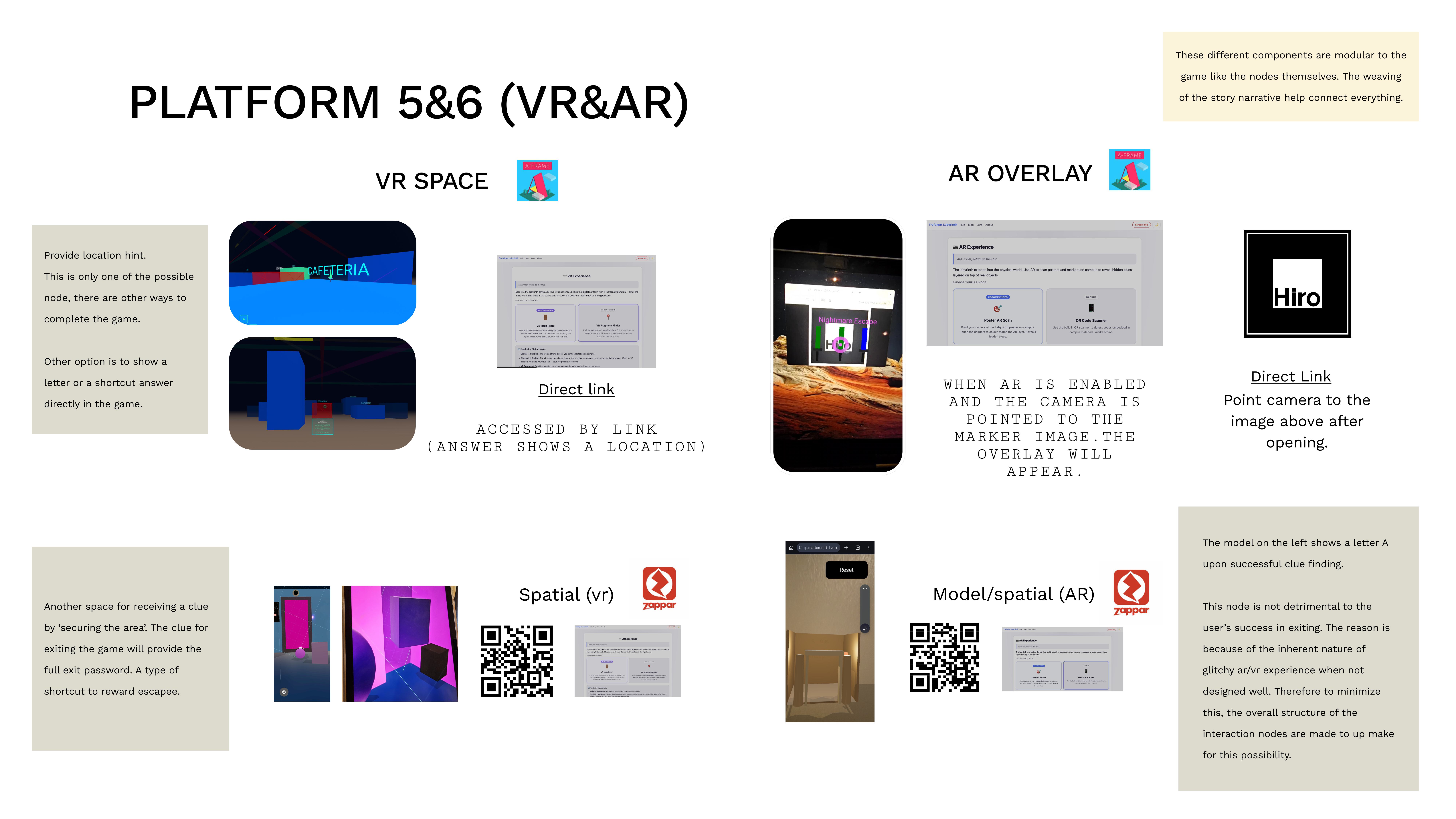
The XR experiences were designed to provide the exit password as a reward for completing a harder interaction. The digital puzzles on the web hub are straightforward choice-based challenges; the AR/VR experiences are more demanding, but the result players get is faster — a fuller answer rather than one fragment at a time.
There are 4 components across AR and VR, placed to provide options to players. If a player chooses to take on the AR/VR challenge, they receive a fuller clue along with a different kind of experience (WebXR). Players who find them skip ahead; players who miss them still finish through web puzzles. Both function as shortcuts, not gates — AR/VR is required by the rubric, but the architecture ensures no single node blocks progression.
The AR/VR platforms themselves are not unreliable — it is the design thinking around possible user errors that makes the experience unpredictable. This was mitigated with simple games and additional instructions, without spoon-feeding players, since player agency is a core theme and the game design emphasises explorative experience. A secondary consideration was technical glitches from phone settings that could halt AR/VR access. This was minimised with settings information, though players are already prompted by Zappar’s own notifications. We assumed players have modern devices since WebXR runs on older mobile devices regardless of Apple or Android — the experience is smoother on newer devices and particularly Apple devices.
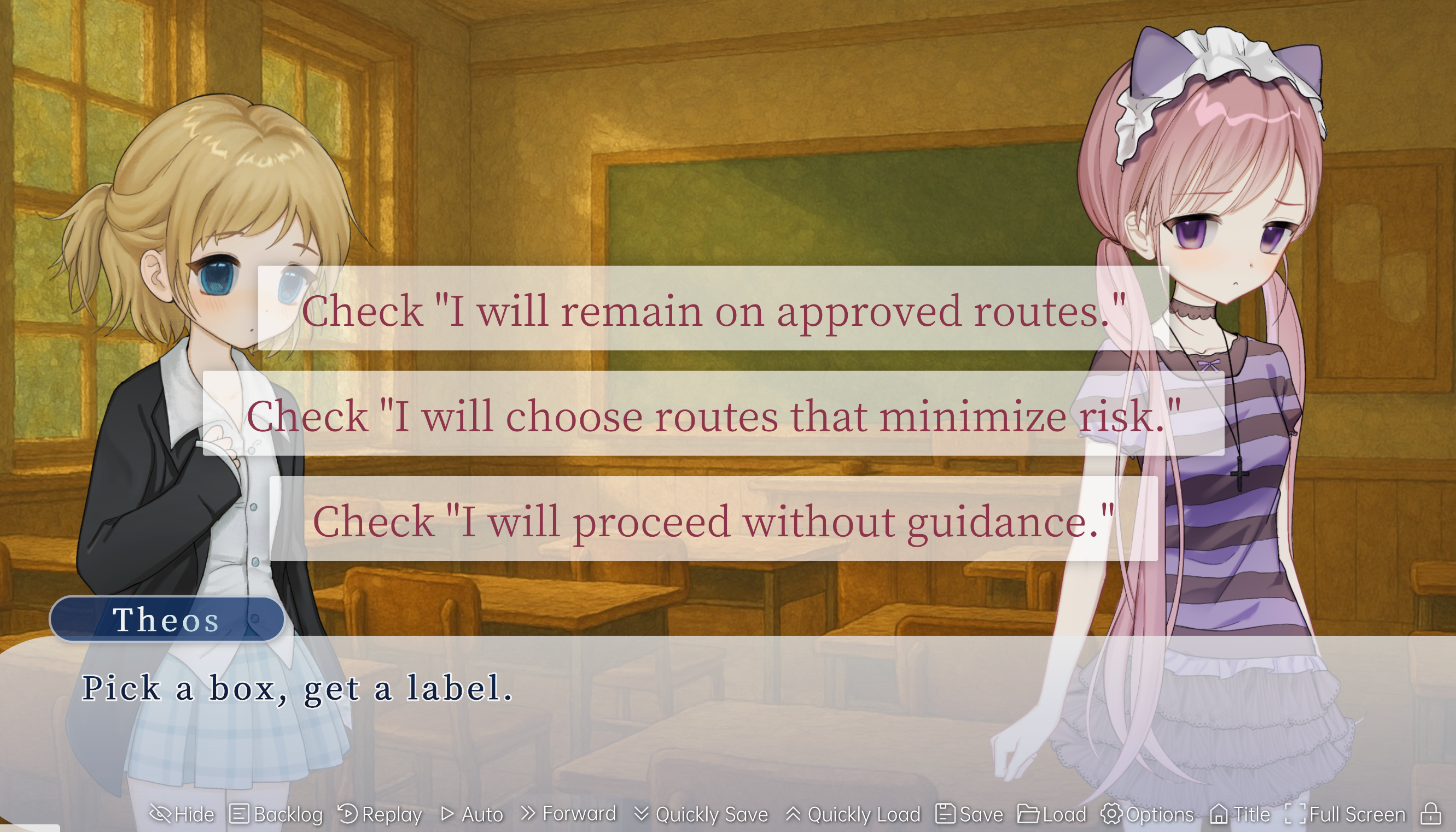
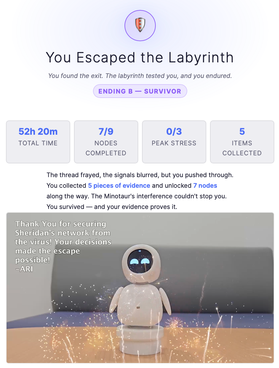
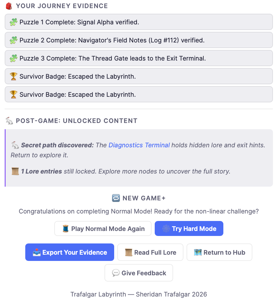
We designed three endings (Won, Observed, Thread Weaver) so the final choice carries weight. These outcomes depend on the player’s choices and their efficiency in navigating the labyrinth, giving the audience a sense of consequence and ownership over their journey.
Complete node maps for both modes, a working config-driven architecture, and paper prototype validation. The route structure was stable enough to begin full implementation.
Normal Mode node map
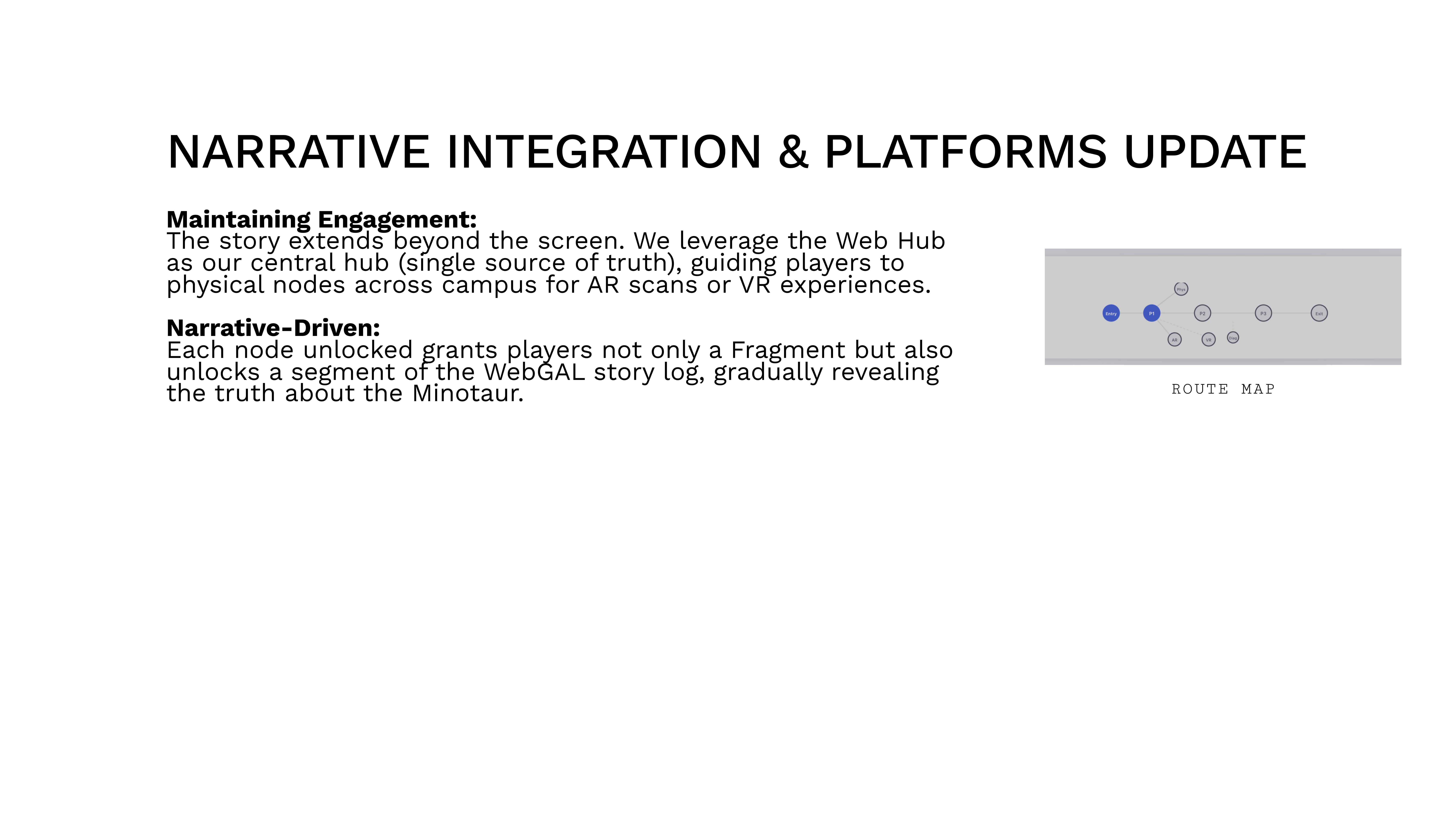
Hard Mode route map
Narrative structure & dead-end mapping
Conduct a cognitive walkthrough of the complete experience and iterate based on findings. P3 was about breaking our own work and fixing what broke.
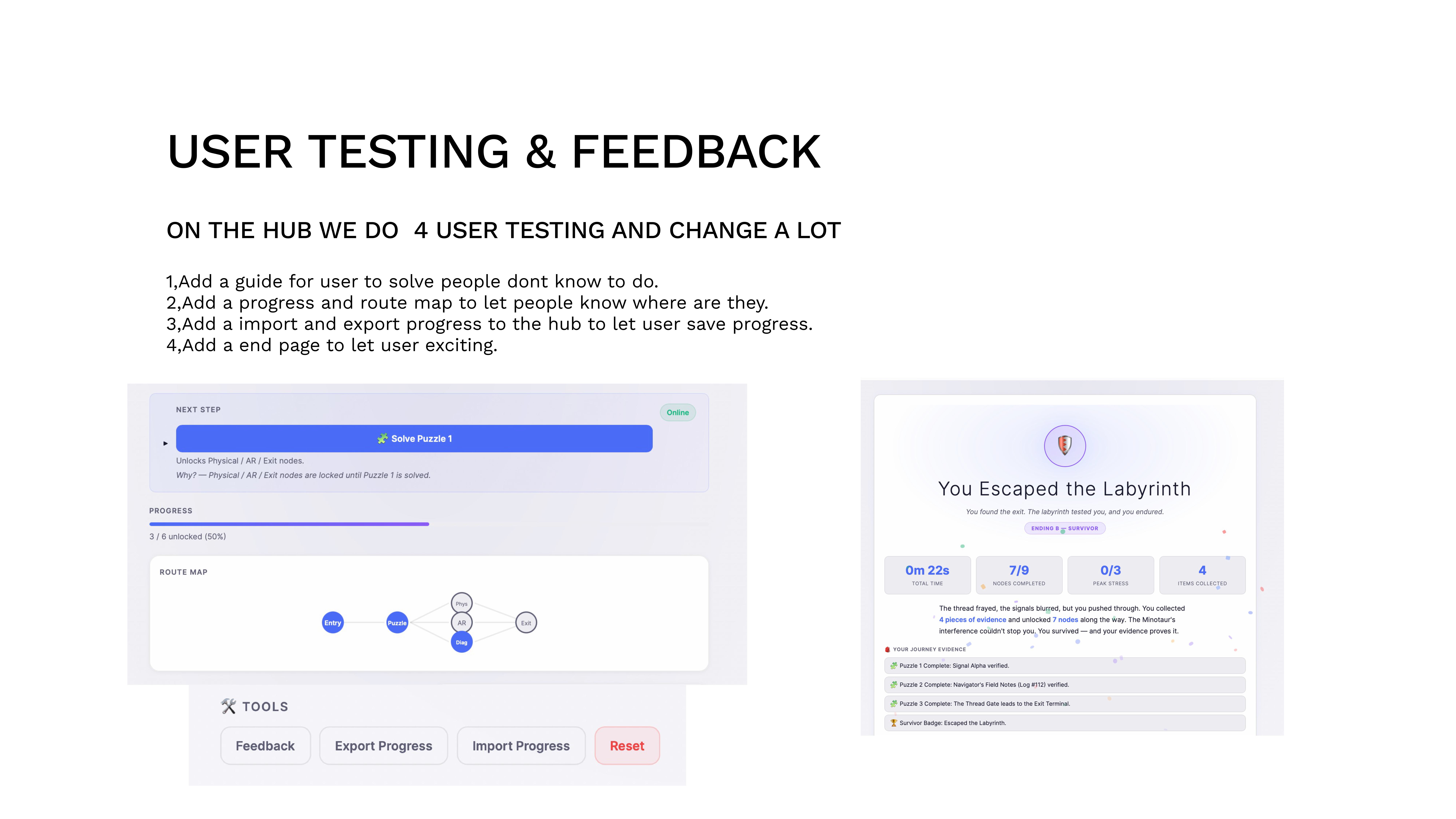
Four rounds of in-person user testing on the Trafalgar campus. We observed testers in real time — watching where they paused, where they got lost, where they left. Every change below came from watching real players struggle, not guessing. The Web Hub and visual novel were tested separately because each medium reveals different problems.
Problem: Testers didn’t understand the objective. They scanned the QR code then froze. Solution: An onboarding guide that explains the premise and mechanics without spoiling the story. Why: We assumed the narrative would self-explain — it didn’t.
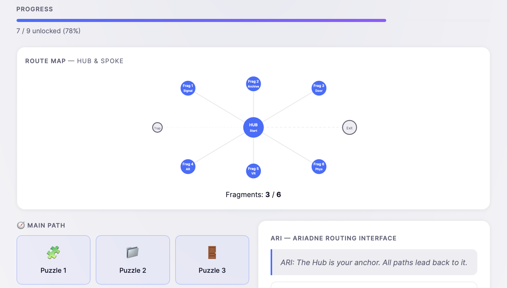
Problem: Players lost track of which fragments they had. Solution: A visible progress indicator and route map. Why: In a non-linear experience, spatial awareness is everything. Without it, exploration feels like wandering.
Problem: The 15-minute estimate was optimistic; some needed to leave and return. Solution: Save/load progress via code export. Why: Respecting player time is a design principle, not a convenience feature.
Problem: Entering the password just… ended. Players felt abrupt and unsatisfied. Solution: A dedicated ending screen with narrative closure and a recap. Why: The emotional payoff is the entire point — cutting it short undermined every puzzle they’d solved.
A tested, iterated, deployable experience. The four testing-driven changes above transformed a confusing prototype into a clean, guided journey. User feedback shifted from “I don’t know what to do” to “I want to play again on Hard Mode.”
Remote surveys would have missed the confusion we observed firsthand. Watching someone freeze at the entry screen was more useful than 50 survey responses saying “it was fine.”
AR/VR is required by the rubric, so the challenge was anticipating user errors and device issues rather than removing the platforms. Simple game mechanics, clear instructions, and settings guidance reduced unpredictability without undermining player agency. When VR did crash on a tester’s phone, the web hub backbone ensured the experience still reached a valid ending.
AI was not useful for video editing — what we needed could be done manually in less time. Debugging with AI was also slow in some cases, so manual debugging was used alongside it. Where AI genuinely helped was asset generation: rapid 3D model ideation (Minotaur test model, maze environment tests, Greek/cybernetic hybrid models) gave us visual direction that would have taken days to sketch by hand.
User testing & feedback
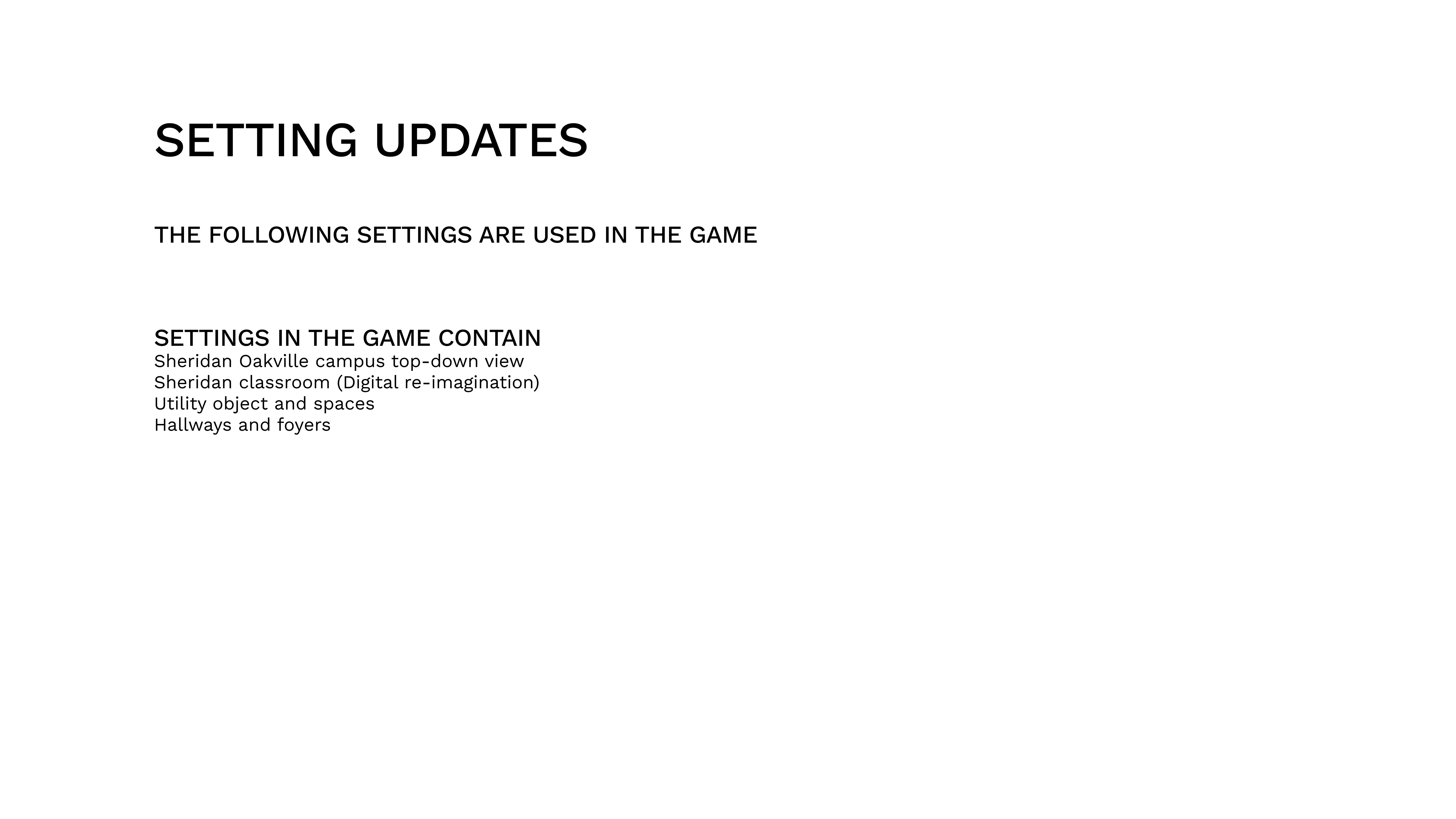
Setting updates
Narrative integration & platforms update
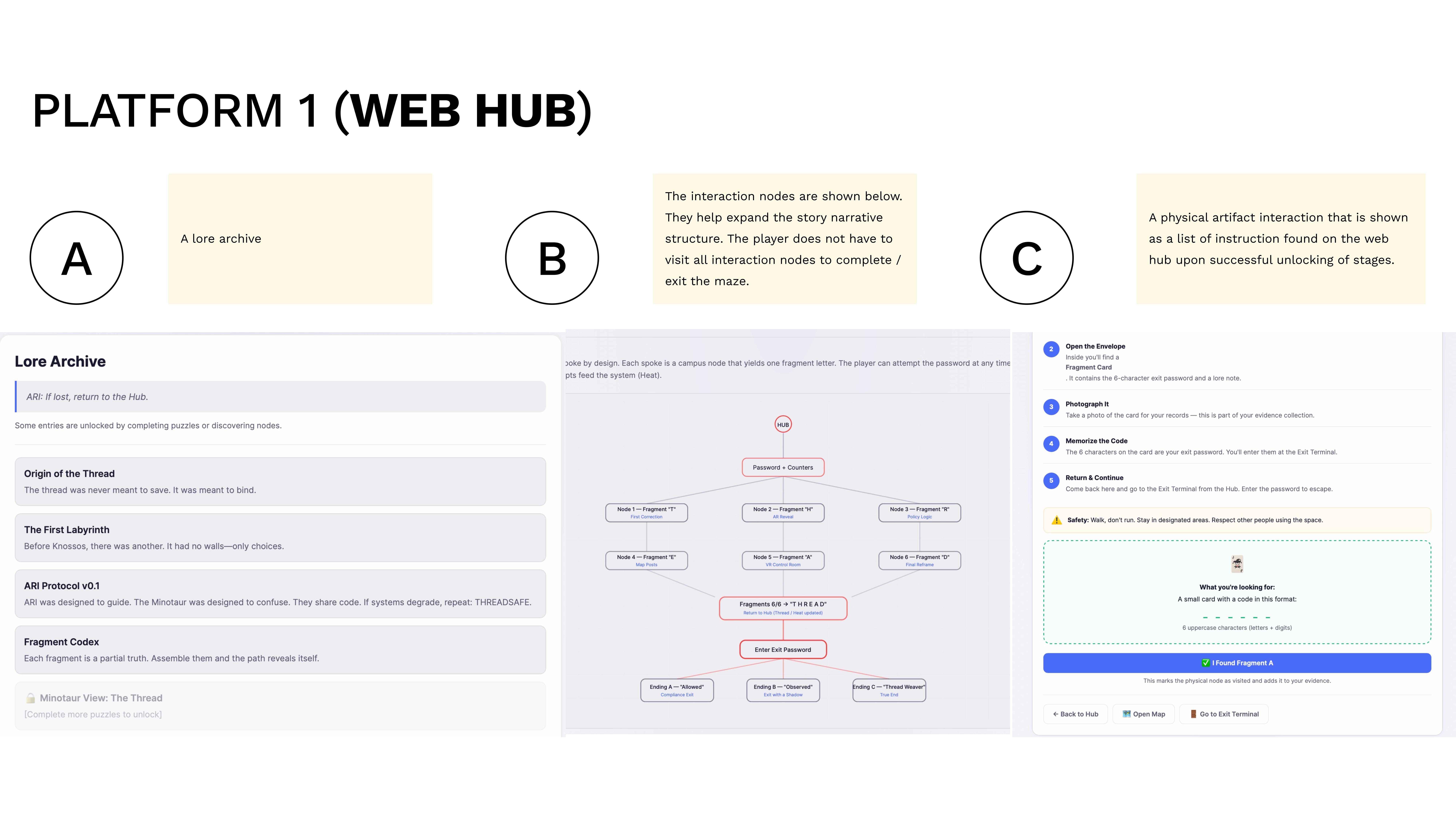
Every space in the game is a representation of a digital environment hacked by ARI to communicate with players. The board below maps every interaction point across AR and VR platforms.
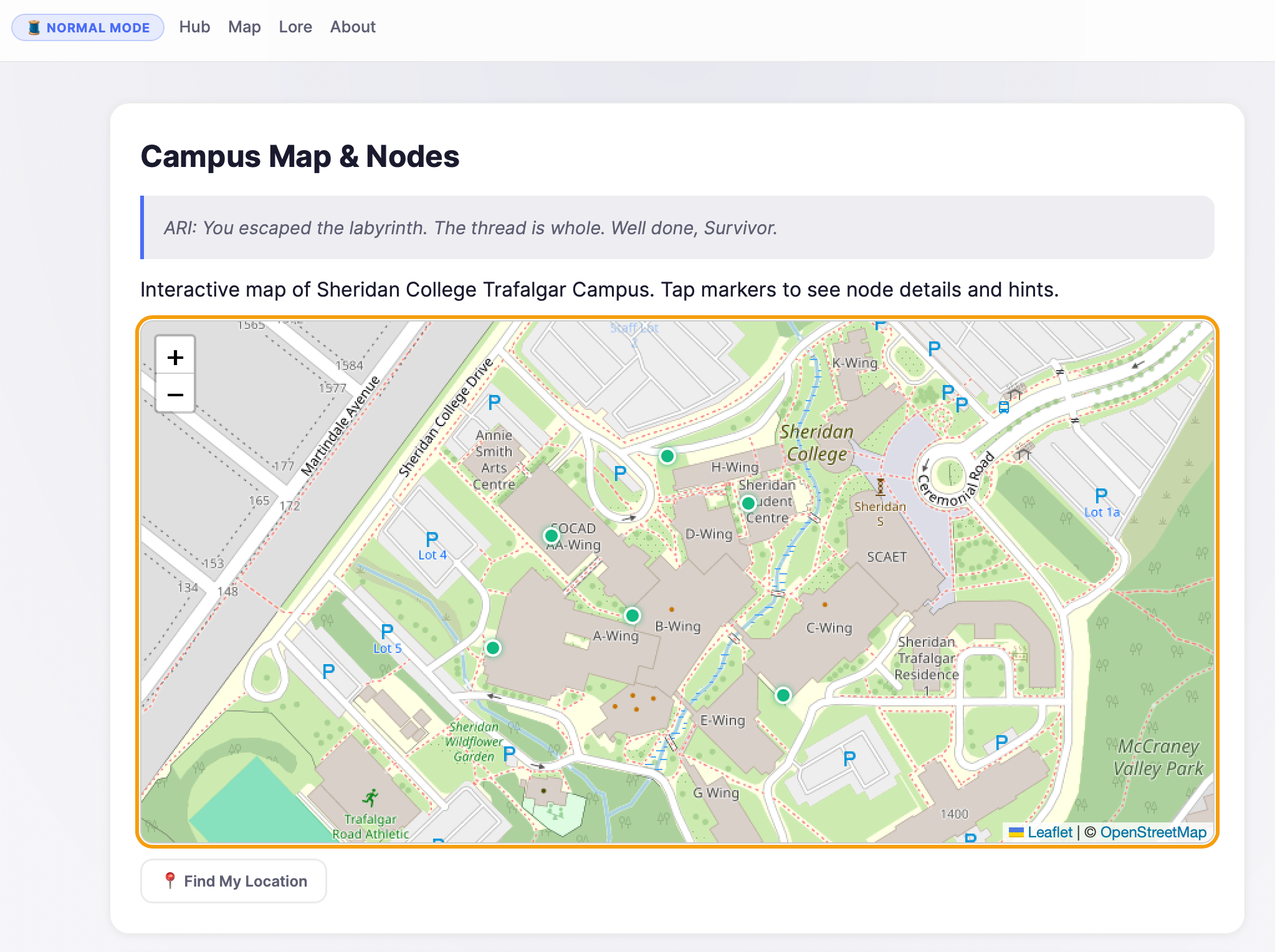
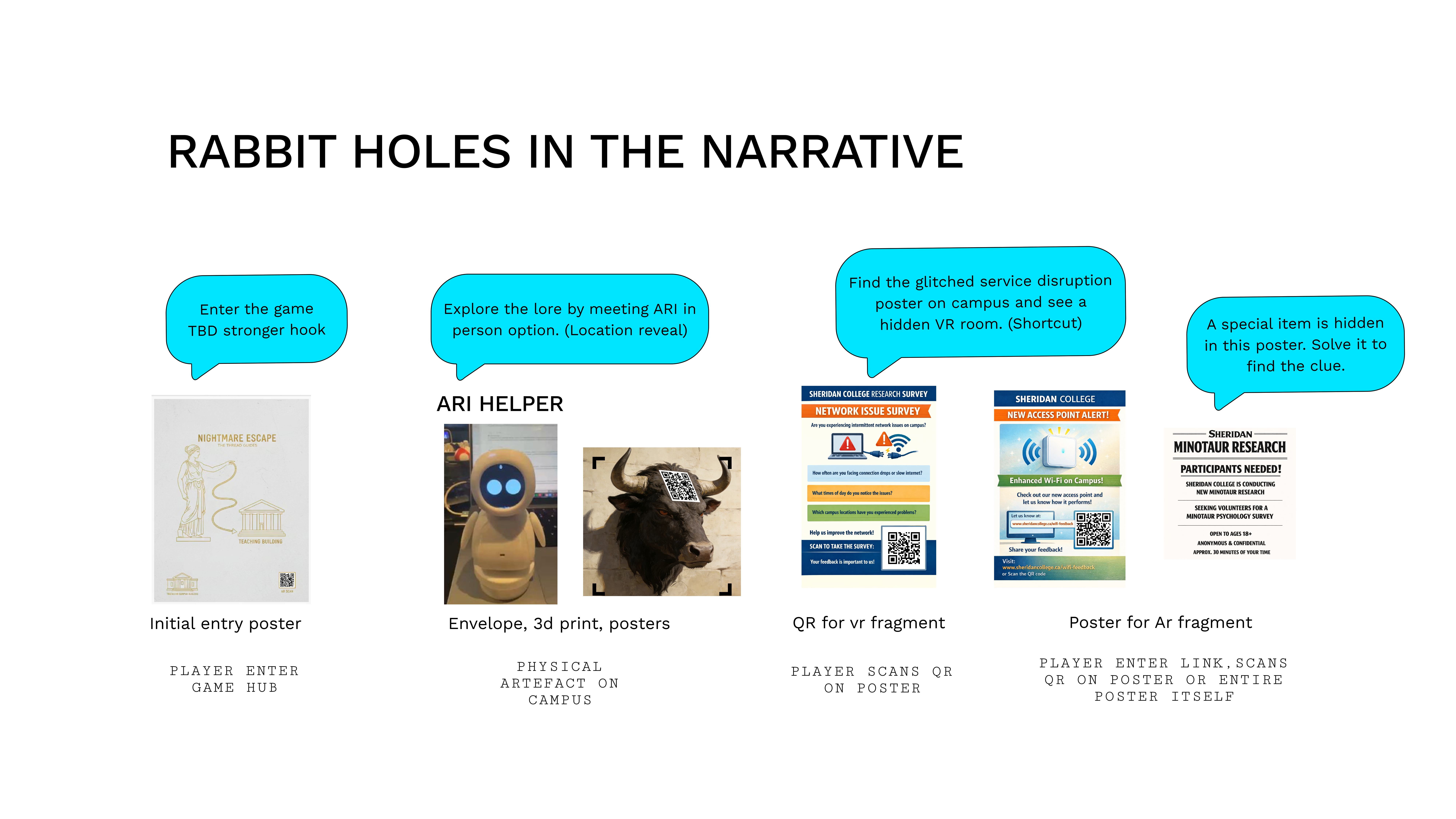
Because the campus system is compromised, ARI actively seeks player help by making access points discoverable in many locations. ARI’s influence extends around the school — physical artifacts placed on campus are manifestations of a digital entity reaching into physical space. The magic is in the unknown origin: how did a digital being place these objects?
One aspect of ARI’s system works by having players help place artifacts for future players. The prior players have been eliminated, abandoned, or lost in the maze — it’s up to the new players to secure the system and exit safely. This layered history gives every access point narrative weight.
Players can guess the exit password THREAD at any time, bypassing puzzles and platform nodes entirely. Game difficulty influences exit conditions — Hard Mode requires all fragments, while Normal Mode rewards clever shortcuts.
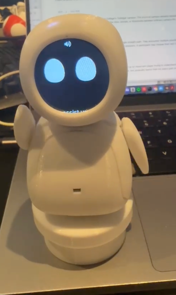
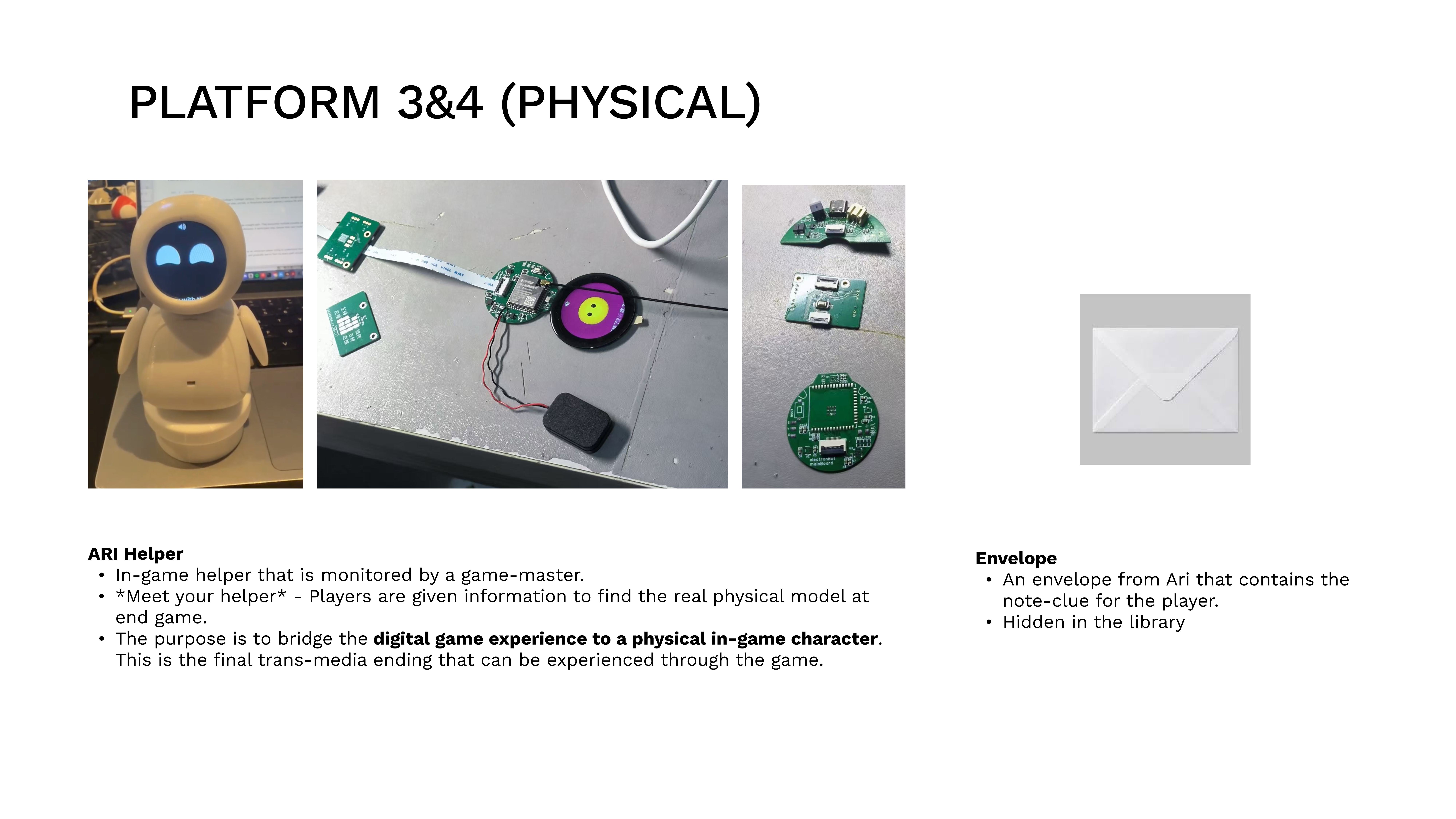
ARI is a digital being who implores students for help. If players complete the full experience, ARI’s physical form is revealed at the end — a reward that closes the loop between the digital labyrinth and the physical campus.
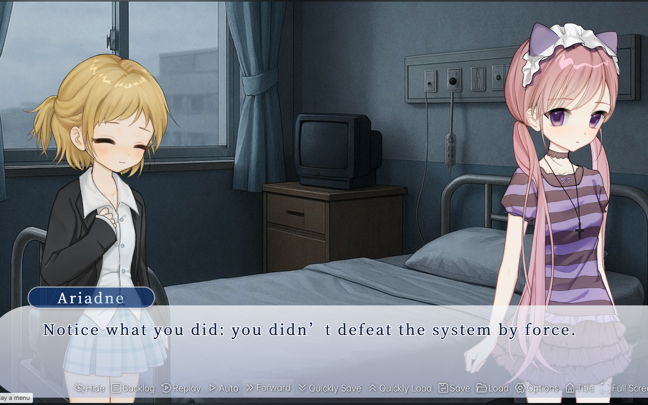
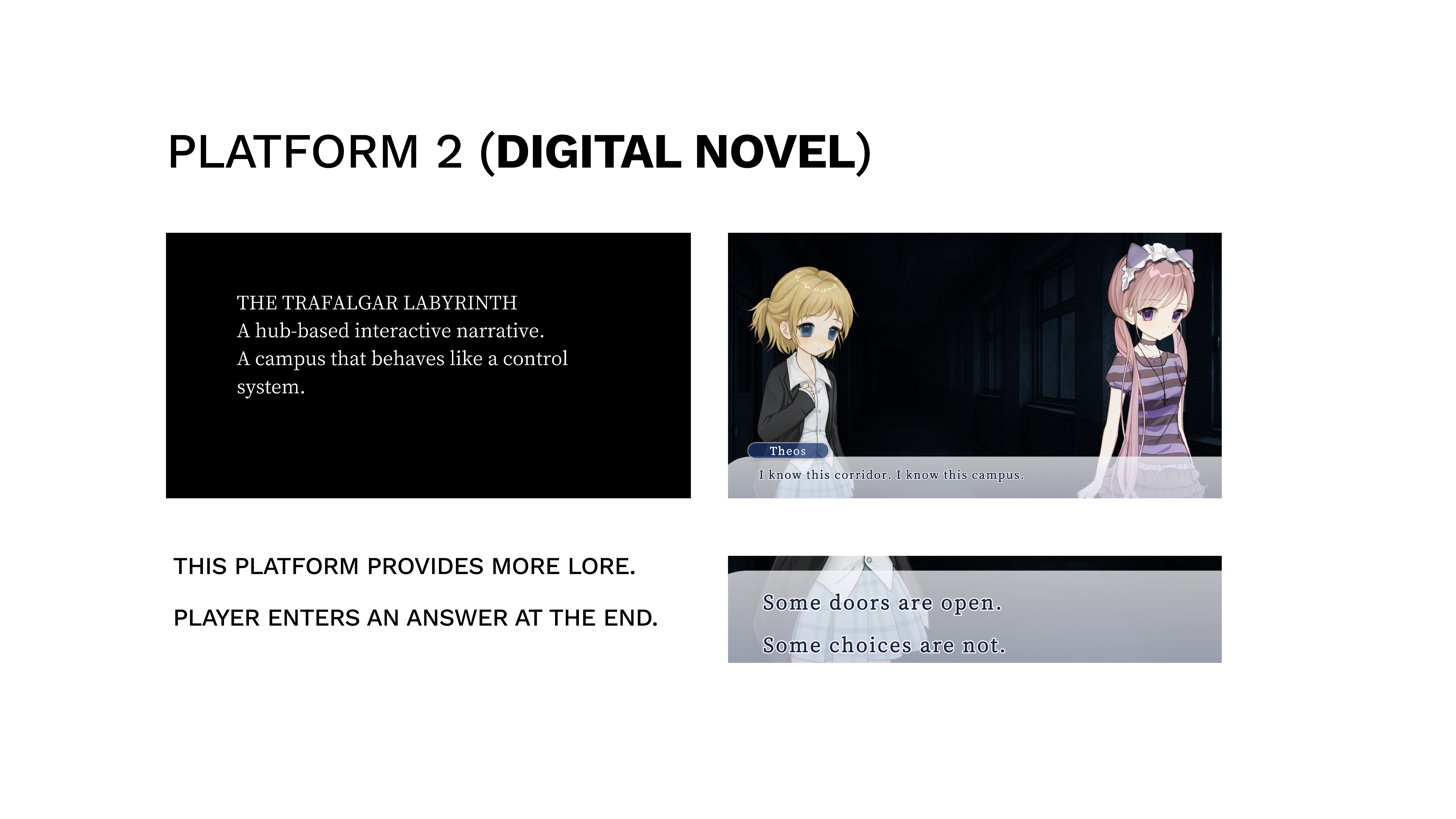
Digital novel through webGAL.
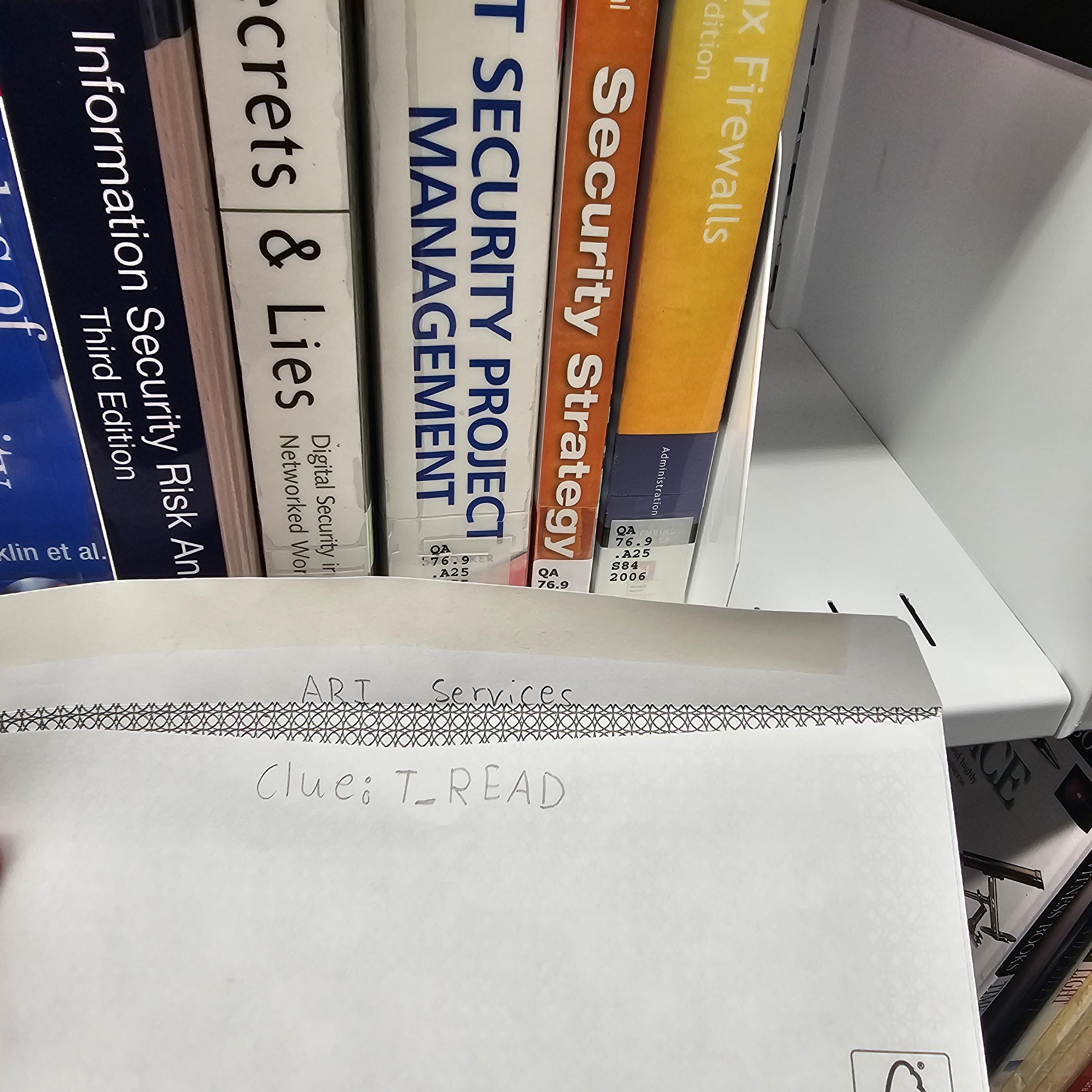
Envelope in library interaction
Player is hinted to go to the library to find the envelope that was placed by ARI with the help of prior players.
Finding and scanning the associated posters and QR codes on campus.
Digital web hub space to physical campus space connection, through web network Sheridan posters.
Participants can interact with content that provides further lore and next-steps.
Can’t see the embed? Open in Figma ↗
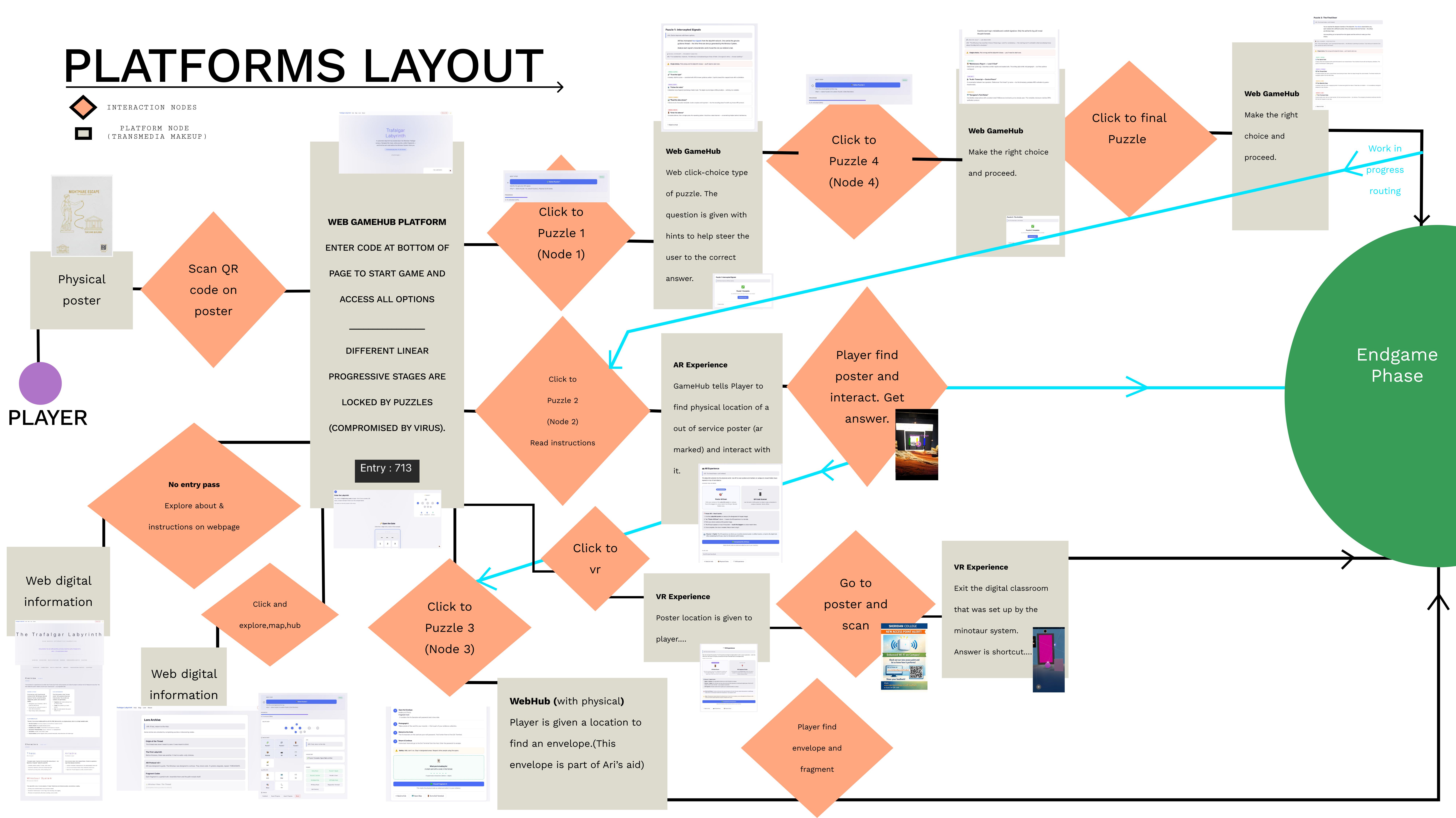
The experience uses a dual-mode route system. Below: the platform layout showing how players move between media, and the hub-and-spoke route diagram showing the node structure.
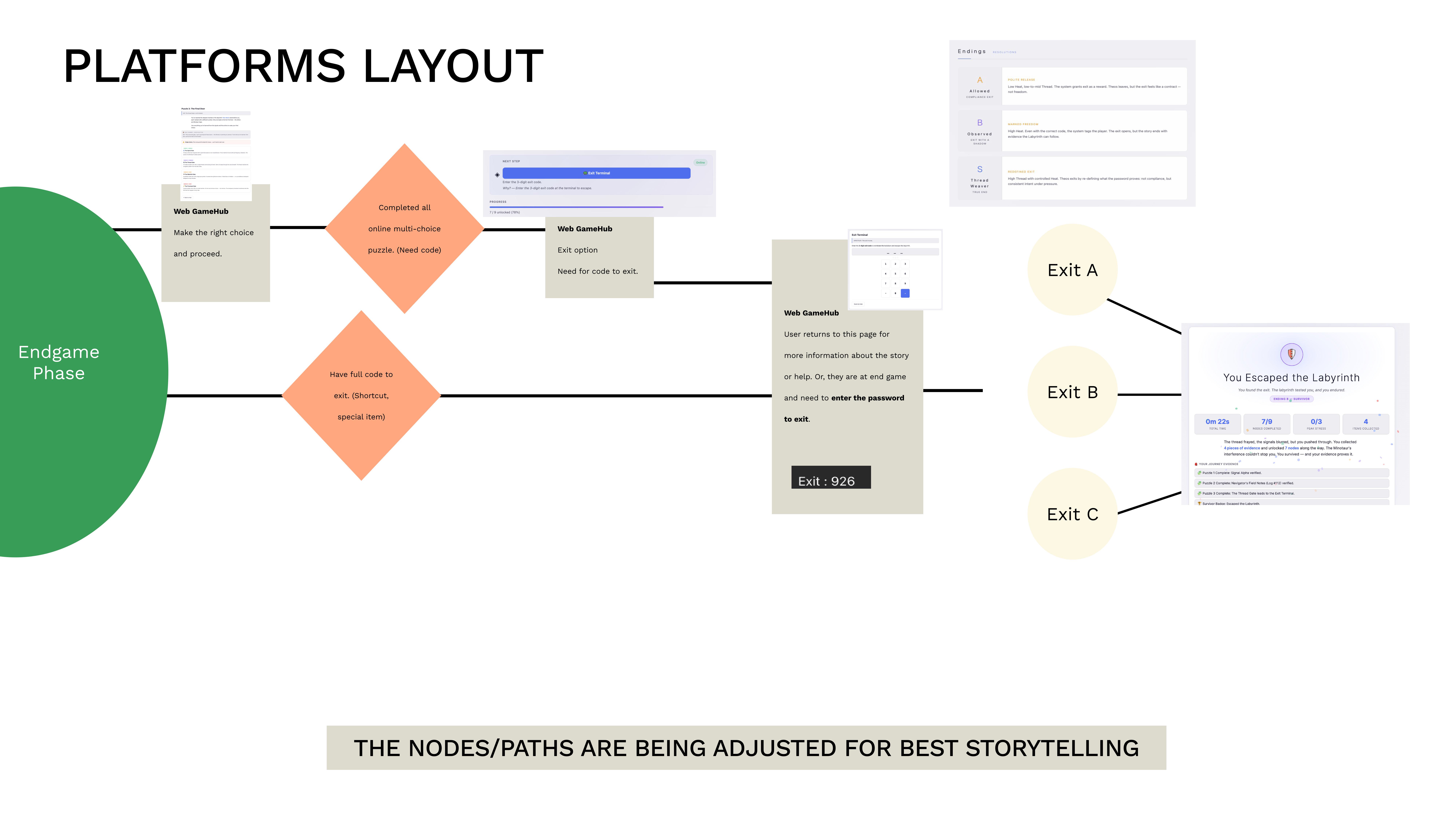
These diagrams map the full player journey from physical poster scan through all puzzle nodes to the three exit endings. The main flow shows how platforms hand off to each other; the endgame detail shows the final branching.
The SVG below illustrates the Hard Mode hub-and-spoke structure: all six fragment nodes radiate from a central hub, and the exit requires collecting all six fragments spelling “T H R E A D”.
Each platform as a modular node. In Normal Mode, players can finish without touching VR or AR (3 web puzzles are the complete path). In Hard Mode, AR and VR are mandatory — all 6 fragments must be collected.
The central nervous system — a single-page hub so players always return to one familiar interface.
A visual novel layer for deep storytelling without slowing puzzle-focused players.
Three physical elements bridging campus and digital space — posters (QR + AR markers) as gateways, ARI Helper model, and a hidden envelope with fragment clues.
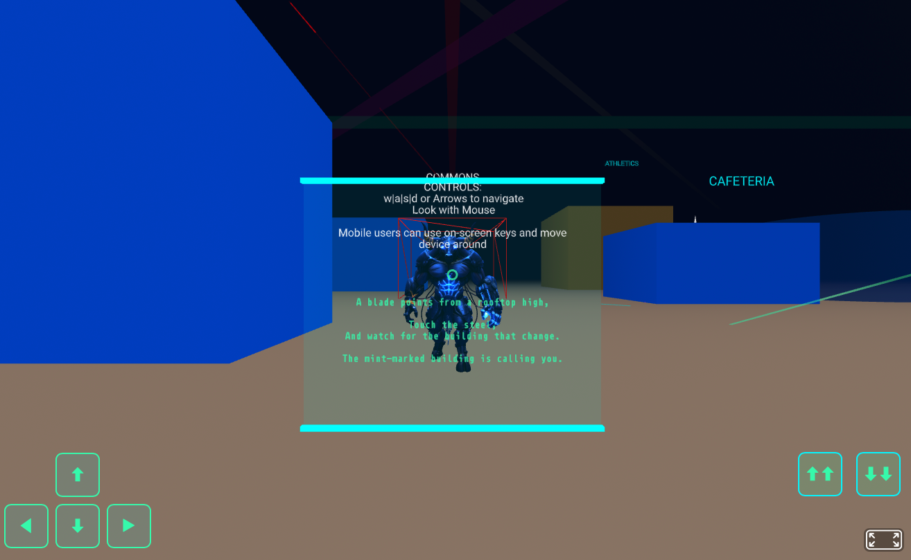
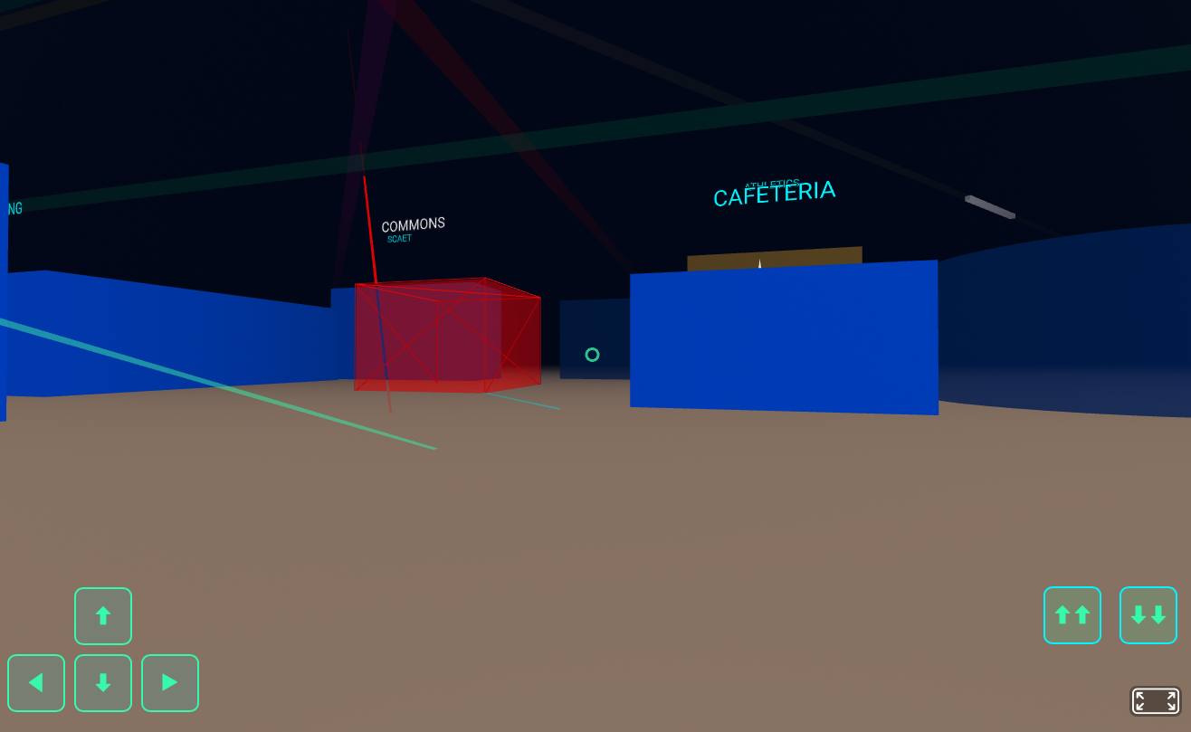
A nightmare maze-room where participants search hotspots to collect story fragments and password pieces. The Minotaur was frozen within the VR space — a result of ARI creating a safe zone inside the compromised network for the player. Headsets can optionally be used (a benefit of WebXR); the experience also runs on mobile phone screens.
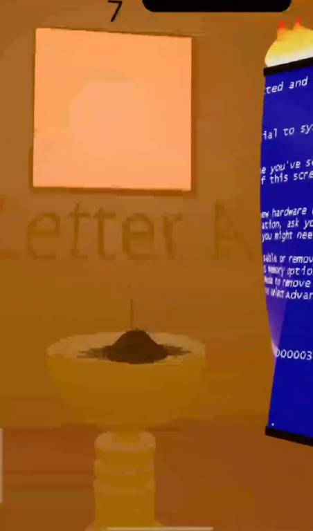
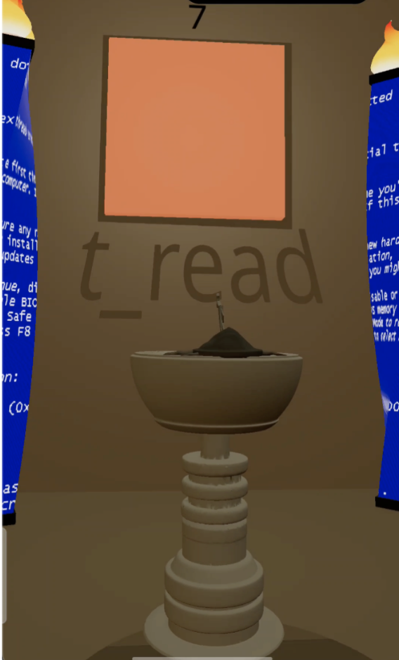
Scan the marker poster to reveal t_read — the shortcut clue. (Older map used “Letter A”; the updated AR layer maps to the shortcut path.)
Three exit routes lead to different endings — the player decides how they leave.
| Category | Platform | Narrative Function |
|---|---|---|
| VR (1) | WebXR / A-Frame ‘Nightmare Room’ | Hotspot search for fragments and password pieces |
| AR (1) | WebAR (MindAR/AR.js) poster scan | Thread hints, warnings, and misdirection overlays |
| Digital (1/3) | Hub website (map + progress + code entry) | Entry + progress backbone (single source of truth) |
| Digital (2/3) | WebGAL chapter pages | Core narrative text and branching fragments |
| Digital (3/3) | Character social / chatbot channel | Diegetic clues + red herrings (optional rabbit-holes) |
| Physical (1/3) | Posters (QR + AR markers) | Primary gateway and hotspot anchors |
| Physical (2/2) | Hidden envelope / card / ‘thread token’ | Tangible reward with fragment/puzzle piece |
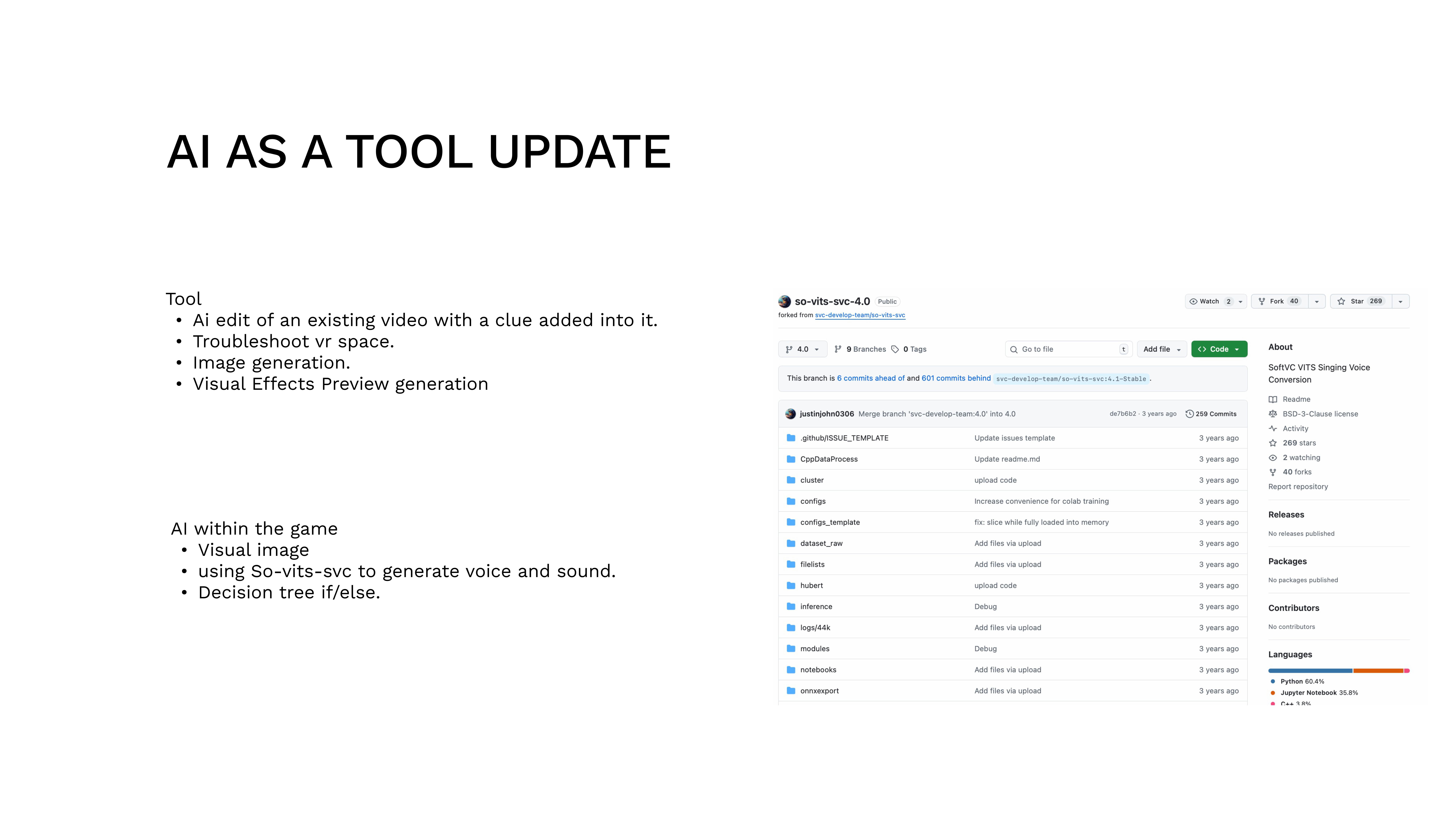
AI was a collaborator with limits. Below are actual prompt→output case studies showing what we kept, what we rejected, and why. Models used: Claude Opus 4.6 (via Claude Code), ChatGPT-4o, So-VITS-SVC.
“Write 10 short ambient lines for ARI, a guidance AI inside a labyrinth that feels like a campus network. ARI should be calm, precise, and slightly ominous. Each line should be under 15 words. The tone is institutional, not friendly.”
“ARI: I exist to reduce uncertainty.” / “ARI: The thread helps — until imitated.” / “ARI: Pattern consistency beats spectacle. Trust the quiet signal.”
Kept 7 of 10. Rejected three that sounded too friendly (“I’m here for you”) — ARI should feel like a system, not a companion. The kept lines now live in config.js as the ariLines array.
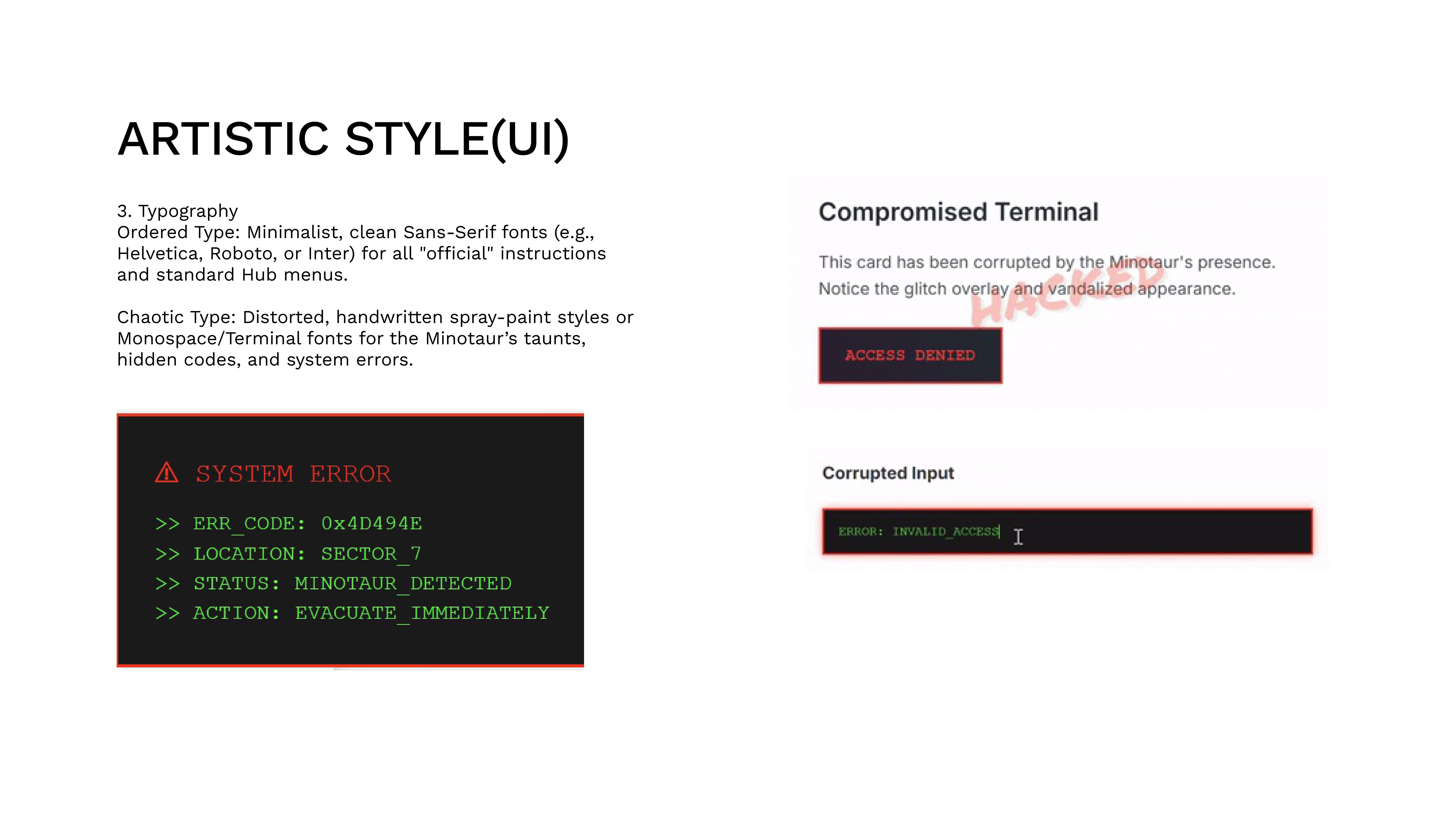
“Generate a dark cyberpunk campus hallway with glitch artifacts, fluorescent lighting, and a faint red grid overlay. The aesthetic should be institutional-horror, not sci-fi. Think: a Sheridan College hallway after hours, corrupted.”
Generated 4 variants. Two were too sci-fi (neon, floating holograms). Two captured the “institutional gone wrong” feeling we needed.
Used as mood board reference only. The AI images informed our color choices but were too generic for direct use. We hand-built all final assets using the palette they suggested.
Trained So-VITS-SVC on a calm, synthetic voice dataset. Goal: give ARI an audible presence in the WebGAL visual novel scenes.
The voice had an uncanny quality — almost human but wrong enough to feel unsettling in a way that undermined ARI’s role as a trustworthy guide. Two weeks of prompt refinement and retraining yielded diminishing returns.
Killed. Switched to text-only ARI. The text-only format actually reinforced ARI’s identity as a system rather than a character — an accidental improvement that came from a failed AI experiment.
Used Claude Code for: validating if/else branching logic across the dual-mode system, debugging state management in the hub, and reviewing the config-driven node architecture for edge cases.
Claude caught three state-leak bugs where fragment counters persisted across mode switches. Also suggested the requiredFragments config key that simplified the entire mode-switching logic.
Kept and integrated. AI was most valuable for code review and logic validation — tasks where precision matters more than creativity.
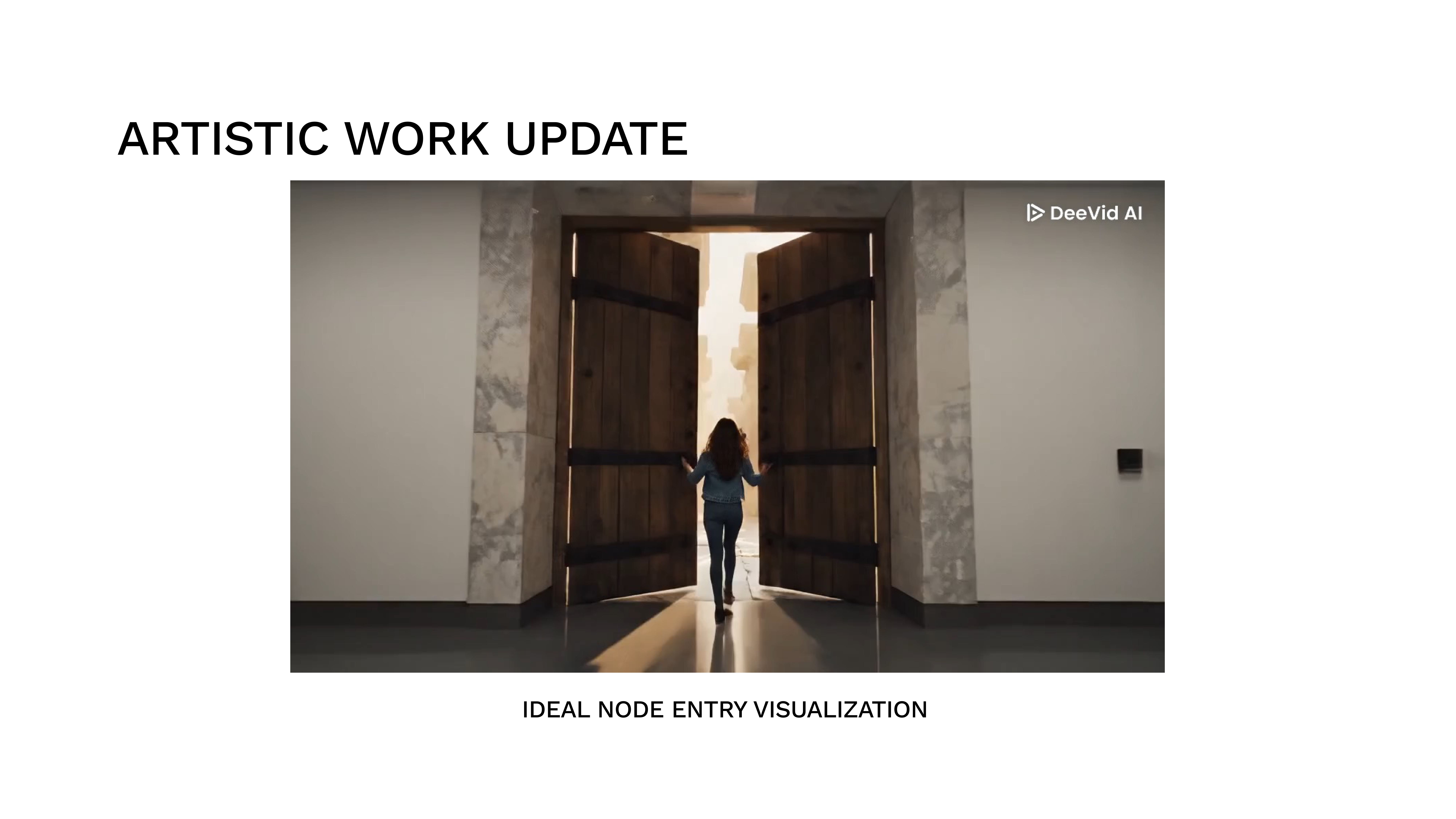
Used AI tools to add glitch overlays and hidden clue markers to existing campus footage for use as video backgrounds in WebGAL visual novel scenes. The footage was shot on phones; AI handled the post-processing effects.
Kept. This was AI at its best: automating tedious, well-defined post-processing work. Manual glitch effects would have taken 3× as long for the same result.
“AI was seldom used because of its uncertain behaviour. The energy spent ensuring a prompt was well-crafted often exceeded the cost of building manually. Through this process, we learned to discern between AI-able tasks and tasks that required our own hands. We were overall successful in creating and chaining different experiences together without AI — and that itself was a lesson in knowing when not to automate.”
AI wasn’t a tool we picked up and put down — it had a defined role in the group structure, like any other collaborator.
Web Hub development, WebGAL visual novel integration, UI/UX design, art direction (graffiti hallways, corrupted campus visuals, atmospheric backgrounds), dialogue and narrative copy, decision-tree logic, and overall project coordination. Responsible for connecting every platform into a cohesive player journey and maintaining the visual identity across all deliverables.
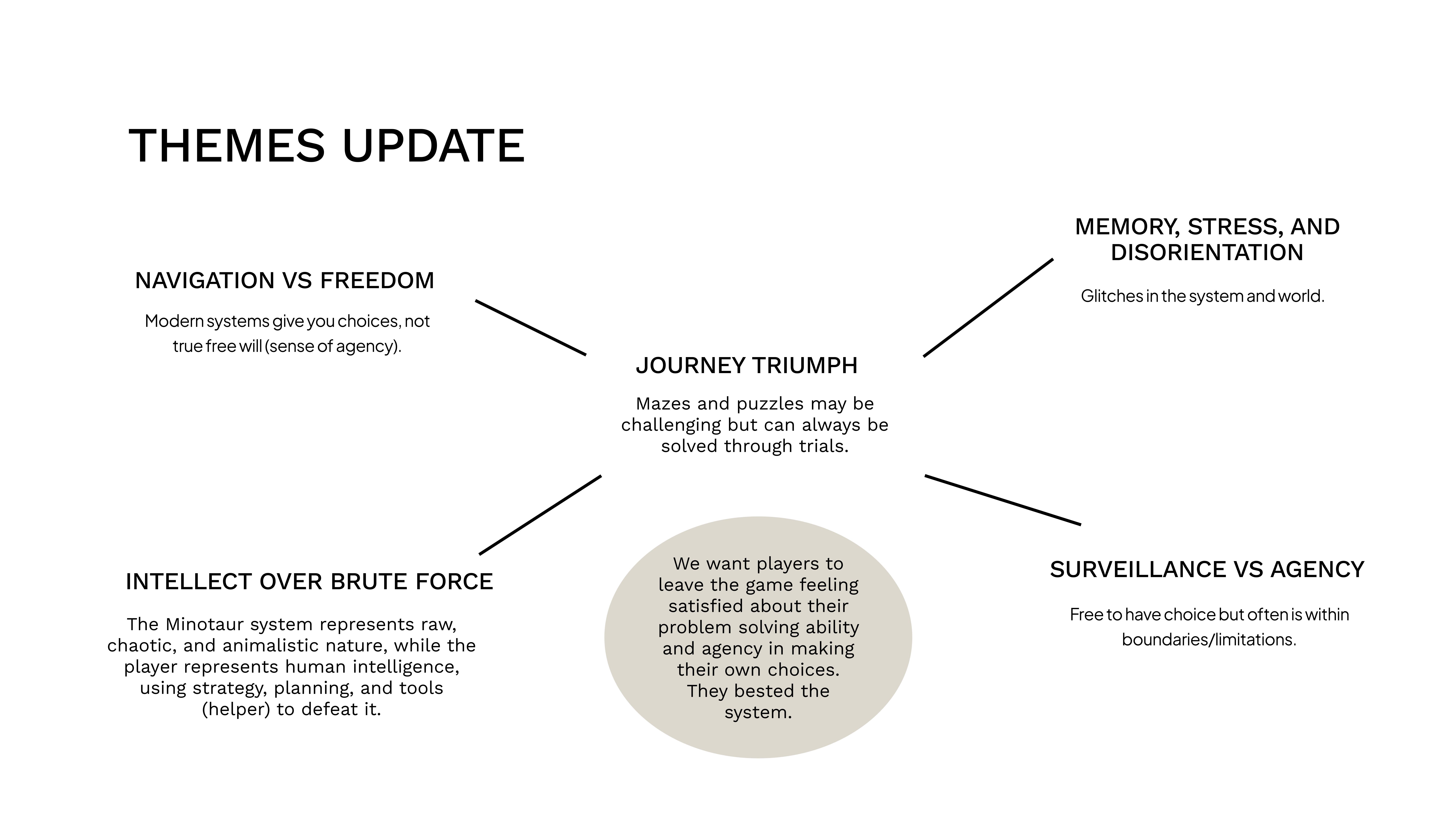
VR space construction, 3D environment design, and physical artifact fabrication. Owned the immersive shortcut pathway and ensured the VR puzzle rewarded exploration with meaningful narrative fragments.
Contributed to lore research and story concept development in the early stages of the project. Responsible for presentation and documentation design, including slides, process documentation, and the cognitive walkthrough report.
Used to quicken prototyping and structuring — humans reviewed the majority of the code and its implementation. AI contributed some graphics for WebGAL scenes and poster assets; all outputs were reviewed and verified by the team. No post-production assistance from AI. It was least effective when creative judgment was needed — several AI-generated outputs were rejected because they didn’t match the project’s tone.
Human reviewed the majority of the code and its implementation. AI was used for rapid prototyping and structuring — helping scaffold logic faster, not replacing human judgment. No post-production assistance from AI. All outputs were verified and checked by human before use.
AI generated concept images and lore drafts that we iterated on. The pipeline: AI draft → human edit → team review → approve/reject. Roughly 40% of AI drafts were rejected for tone or quality reasons.
We consulted AI when stuck on design decisions (e.g., “should the timer punish or just pressure?”). AI provided options and trade-off analysis. The final decision was always human. AI was an advisor, never a decider.
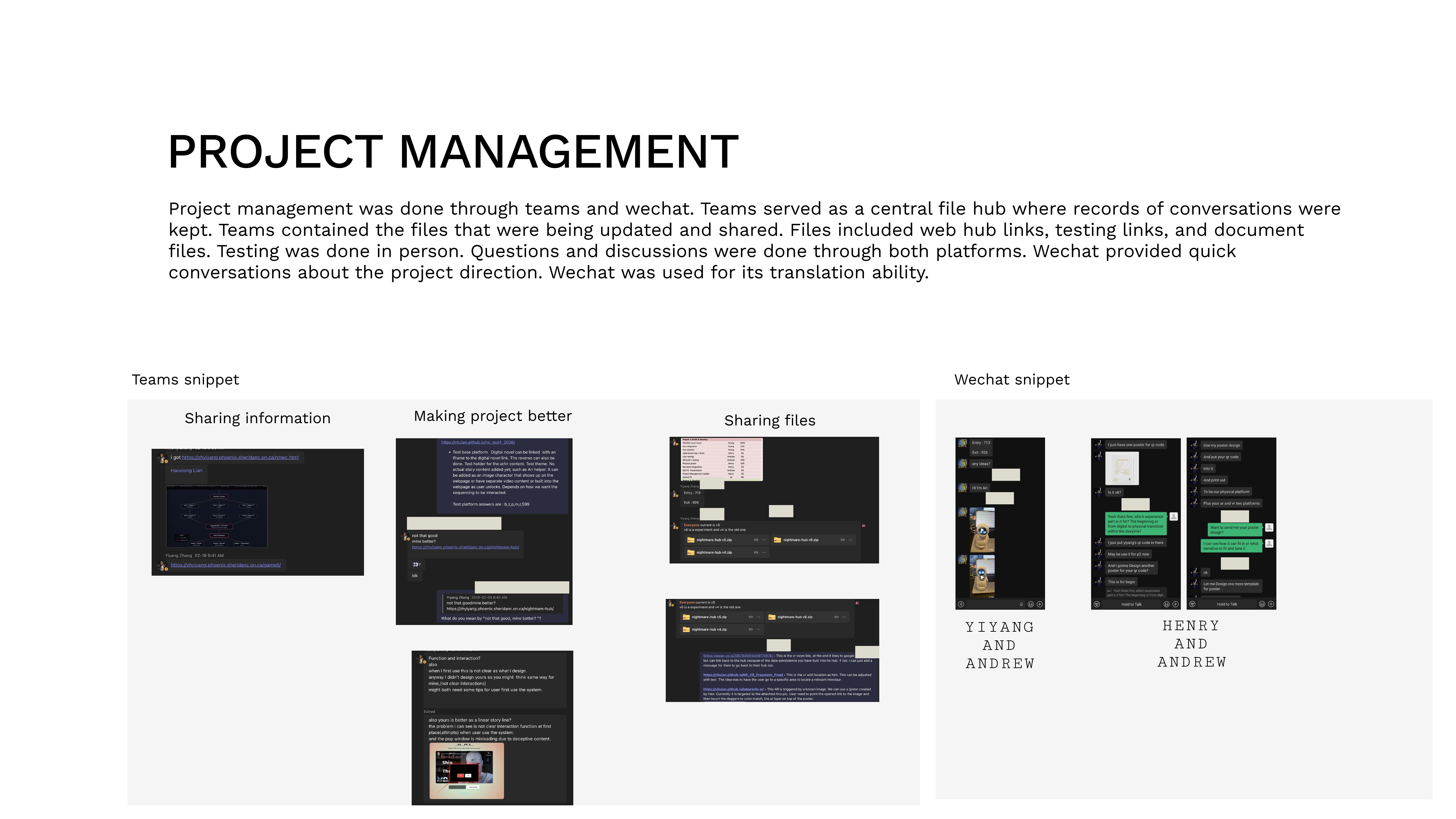
Project management ran through Teams (file sharing, link archives, test records) and WeChat (fast decision-making, translation). User testing was always conducted in person to observe real reactions rather than rely on surveys.
We chose this split because each member could own a platform end-to-end, while Yiyang coordinated the hub that stitched them together. AI was integrated into the workflow — not as a separate phase, but as an ongoing collaborator with defined boundaries.
14-week schedule with P1–P4 milestones, weekly task assignments, and dependency tracking.
Can’t see the embed? Open in Google Sheets ↗
Every visual artifact from the project, filterable by deliverable and type. Each asset is captioned with origin and date.
Project management artifacts, live deliverables, and supplementary references.